Yuri Suzuki
The Japanese innovator on demystifying the modern world without losing his child-like sense of fun.


It could be argued that the goal of many product and graphic designers is to get to the heart of a thing; to relate information and ideas in the simplest possible terms, that they might be understood by anyone. And yet, today we are surrounded almost constantly by levels of technology that feel impenetrable – as though we’d need to spend years face down in a textbook to have any real hope of understanding. Trying to untangle and explain how such technology actually works seems like an impossibly daunting task.
This would be an over-simplified way of explaining the driving factors behind Japanese designer Yuri Suzuki’s work process. Like the best teachers, the 32 year old’s inspired approach is contagious and memorable. Still with that wide-eyed amazement for the world, he manages to not only share his enthusiasm for knowledge, but makes it something truly infectious.
This desire to simultaneously explain and entertain stems in some ways from Yuri’s own struggles with dyslexia. “I try to avoid reading when I can,” he says “so I need a really easy entrance into understanding.” The focus of his work often involves taking on complicated, seemingly unbreachable subjects, and reconstructing them into something that is already lodged in a more familiar system of understanding. His relationship to technology is bittersweet. “Modern technology is like magic” he continues. “People rarely understand what’s actually happening inside."
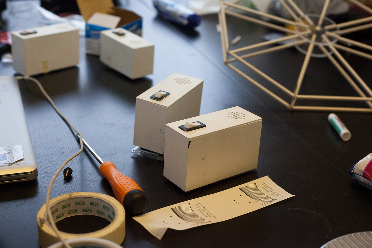
Modern technology is like magic. People rarely understand what’s actually happening inside. His Denki Puzzle project (2012) is a perfect example of this practice. Here, Yuri unravels the intricate world of electronics and turns it into a familiar children’s building toy. By doing so he both simplifies the process into a more digestible language while also opening it up to an audience that may have been previously put off by the dense subject matter. By explaining the basics of creating an electric current in this way, Yuri plays with the established perception that these fields are impenetrable, and overwhelmingly complex. “People have a fear of fixing broken electronics,” he says, “so I really want to make a new way of designing them so it’s an easier, more graphical and therefore accessible system.”
Yuri's Tube Map Radio (2012) adopts a similar approach: taking a format that people are familiar and comfortable with, and using it to explain something that they’re not. “I did some research and found that the tube map’s designer used to be an electrician. Apparently he actually designed the tube map based on an electric diagram.” Take a look at Yuri’s resulting design, and this comes as little surprise. In his version, the traditional circuit board has been reconfigured using the graphic simplicity of an underground tube map. By changing the language that the schematic information is relayed in, everything suddenly becomes less intimidating. “You already understand everything about it so it makes for an easier application.”

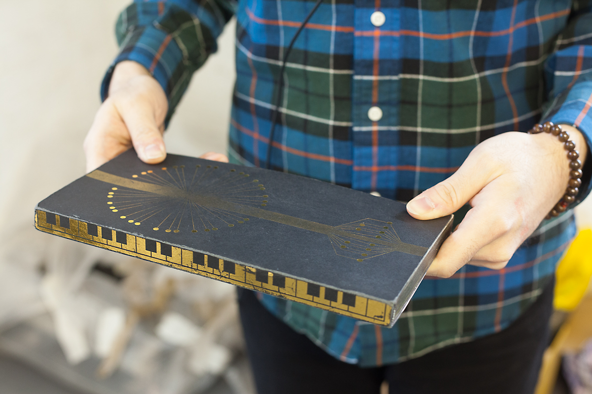
This philosophy of reinterpreting information can be seen throughout his portfolio too. Take Colour Chaser (2010), for example: a small, wheeled robotic box that is programmed to follow a black line drawn on a piece of paper. Perpendicular scribbles across this line in turn relate to different musical notes, depending on the colour. Yuri explains that this project was all about inventing new ways of visually understanding melodies, or as he calls it “the physical representation of the music;” When he was younger his dyslexia made reading traditional sheet music almost impossible (something that proved problematic during his early years in a ska band). “My band members were trying to be professional at that time and they wanted me to read the score. They told me: if you can’t read the score we have to fire you.” The Colour Chaser project was about finding a way around that.
Unsurprisingly this device has proven popular with the children in the educational workshops Yuri is involved in. “It’s quite helpful” he says, “because even though they don’t have any real knowledge about music, they can still understand the principle.” It’s this combination of innovative educational ideas and a sense of playfulness that encourages and also rewards interaction with a Suzuki design.
Interestingly music has played a key role in several of his projects – perhaps most notably in Sound of the Earth (2009-2012), a spherical black ball that acts like a globe-shaped record, allowing the user to pick any location and listen to the sounds or music from that point on the planet. Yuri recorded a vast library of audio samples over the four years he spent traveling after he graduated. “It was a shame to be just traveling and not making a project out of it,” he says simply.
Such positivity, combined with the playfulness inherent in his work has quite understandably seen Yuri handpicked for numerous brand collaborations. An opportunity he doesn’t shy away from. His Sound Taxi (2012), part of a project to help promote AiAiAi headphones, for example, involve the refitting of a traditional London taxi with comically large, cartoon-esque speakers which detect sound from surrounding traffic and use it to trigger various musical samples.
If a designer’s primary task is indeed to take something and either simplify or expand its scope, then Yuri Suzuki is a unique force in the creative world. His desire to not only understand, but also enable others to do the same is a refreshing change from the common mentality of safeguarding technological knowledge. For Yuri, curiosity is his main motivator. And, as he says himself, “I just have a question about how it works. How it all works.”



Discussion