World trade is prettier than you think
The globe of economic complexity visualises all of the spending in the world

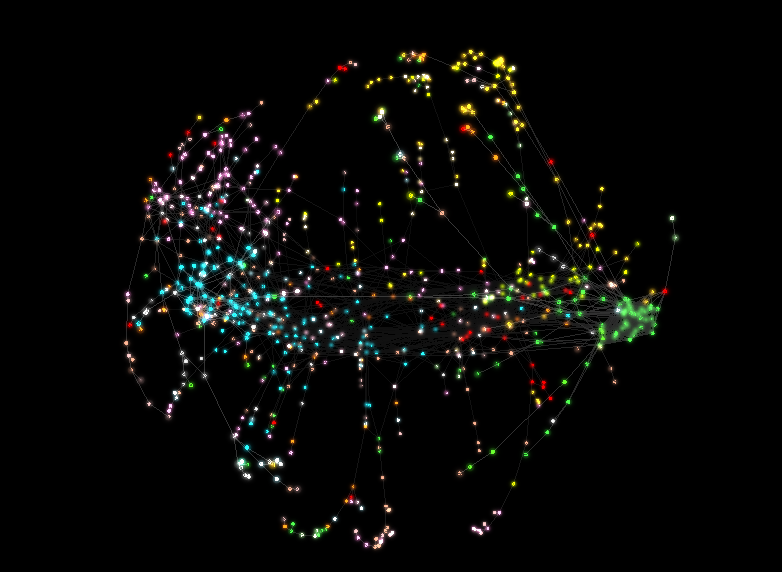
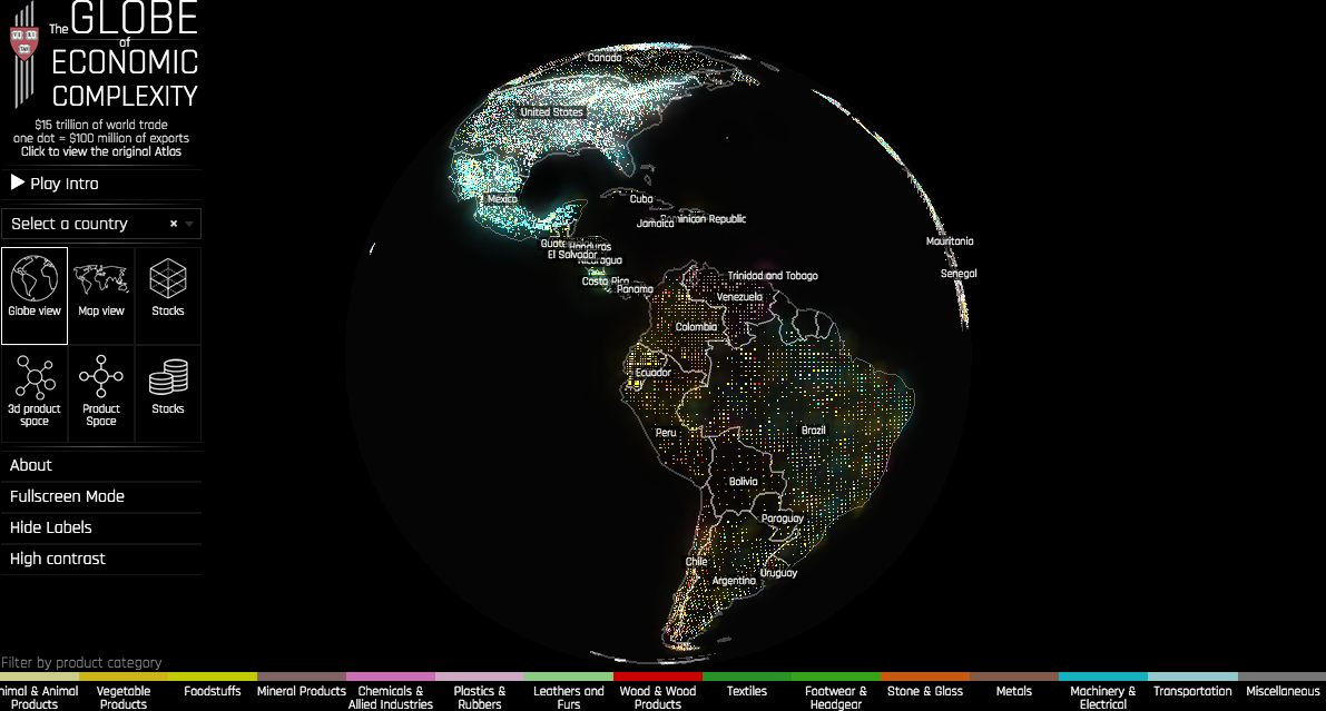
The Globe of Economic Complexity visualises all of the spending in the world Global economics is pretty hard topic to get your head around if you’re not one of those people who are paid to understand it. Way harder than remembering how much a pint of milk is, which seems to be a measure of basic fiscal competency. But there’s some great news for all you lactose intolerant big data fans out there, because some nice researchers at Harvard have made all of the world’ $15 trillion of trade look a great deal prettier than it is. But also – and more importantly – a lot easier to understand. Even if you think a pint of milk costs about a fiver. Created by Owen Cornec and Romain Vuillemot, the Globe of Economic Complexity is a data visualisation project by Harvard’s Centre for International Development. World economies are re-imagined as clouds of confetti in a navigatable map, with $15 trillion of world trade presented in 153,000 dots, each representing $100 million. The data can be reorganised into node link diagrams and export networks, allowing users to view and compare the movement of products worldwide in different categories, including cars, onions and human hair.Recently we've seen people using data in new and innovative ways, such as Squarepusher using local information to produce customised shows. Audience's are learning what their contribution means as well, and our survey shows that a large number are willing to forfeit their online data if they get something in return. Still hungry for more? Sign up for our weekly supplement featuring the latest news, profiles, features and innovation
Discussion