Wind Map
Google computer scientists Fernanda Viégas and Martin Wattenberg have just launched a new project called Wind Map which visualises wind patterns in the US.

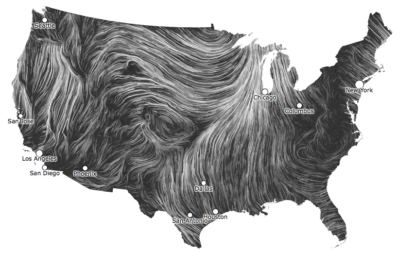
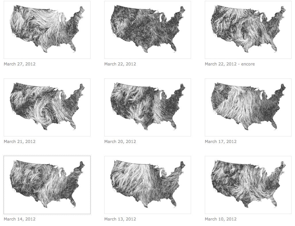
Google computer scientists Fernanda Viégas and Martin Wattenberg have just launched a new project called Wind Map which visualises wind patterns in the US. While that may not sound like it would blow you away, the simple and aesthetic map is mesmerising to watch with wind strengths portrayed as white and grey lines that constantly shift and flow across the different states. The map is updated hourly with data from the National Weather Forecast service and can be viewed as a live stream or as a snapshot of a whole day.
The team behind it believe this kind of data visualization can be used to help people think collectively and move beyond numbers or stats into the world of words and images. For this project they believe that by illustrating the wind patterns over the US they can get people to consider the potential for wind power to be harnessed as a sustainable energy source. As they explain: 'an invisible, ancient source of energy surrounds us — energy that powered the first explorations of the world, and that may be a key to the future.'
We hope that the Wind Map project will soon incorporate data from the rest of the world. In the meantime, head to the site to explore it for yourself.
Discussion