Watching New York Run
A class in Interaction Design at New York's School of Visual Arts, has set about understanding how the city runs through data…

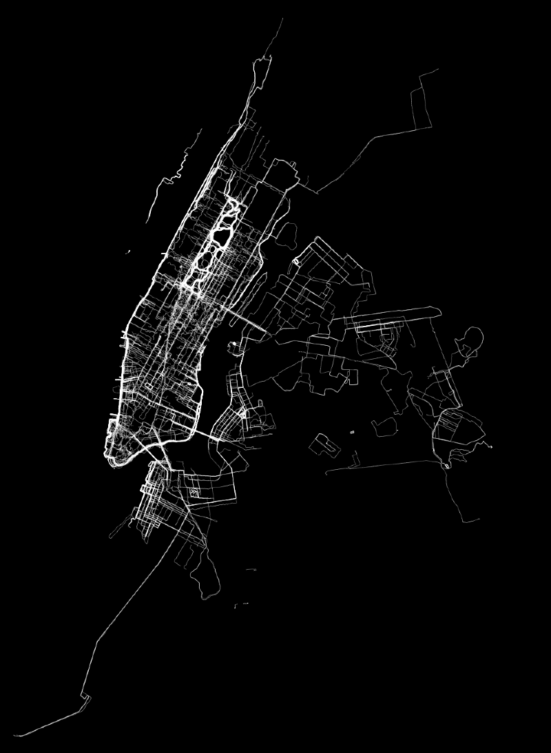
A class in Interaction Design at New York's School of Visual Arts, has set about understanding how the city runs through data and design. The class, taken by infographic design giant Nicolas Felton, poured through a dizzying 500,000-point heavy dataset of New York runners using Nike+. Between 7th September and 21st December 2010 the 1000 runners put in some 6986 miles. An equivalent to the air distance between Manhattan and Seoul.
The project paints a revealing portrait of where, when and how New Yorkers run. Once broken down the data can identify popularity in routes, times of day, patterns of pace and distance, and as Cooper Smith's above piece shows, trace the outline of the City.
However, as Allison Shaw point out in her "Nike+ Is Kinda Bullshit", this technology still needs some work. She points to the runner that paced himself so slowly he seemingly went back in time, a number running the speed of cars, altitude figures the height of airliners, and what could be a newly identified 'Bermuda Triangle' around the Guggenheim where a handful of NYC marathon runners appear to drop off the map.
Take a look at more of the great work from Felton's SVA course here.
Discussion