Two Trains
Artist Brian Foo uses music to reveal the wealth inequality across a New York subway line

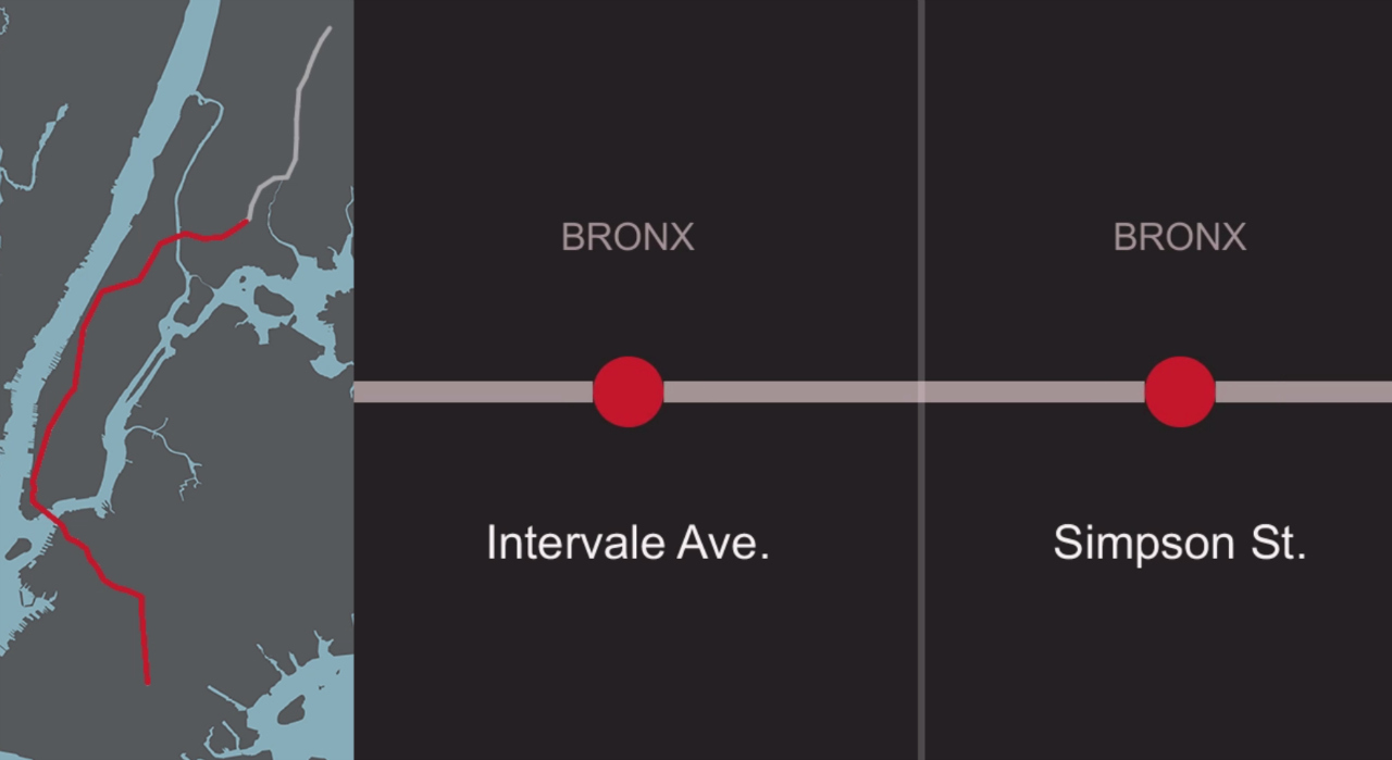
After seeing an interactive infographic depicting economic inequality in New York, artist Brian Foo a.k.a Data-Driven DJ was inspired to create a 4.5 minutes long song that traces the various median household incomes along the number 2 train line.
The track, entitled Two Trains, rises and falls based on the neighbourhood the subway passes through. Foo approached the project by first spliting the song into 48 parts, each part corresponding to the distance between two train stations. He then used the data from a 2011 census to adjust the intensity of the song so that it matches the affluence of each section - the higher the income, the greater the number of instruments used.
"As you pass through a wealthier area such as the Financial District, the instruments you hear in the song will increase in quantity, volume, and force. Stylistically, I want the song to exhibit the energy and orderly chaos of the NYC subway system itself", says Foo, ”Also, I tried to select agnostic sound traits (e.g. volume, force) to correlate to median income rather than biased ones (e.g. sad vs happy sounds, vibrant vs dull sounds) to further let the data 'speak for itself.'"
Foo plans to further explore his penchant for data-driven musical applications by releasing a compilation of 12 income-related ”sound maps”.
More and more artists are using data for inspiration. In doing so, their reinterpretations allow us to see (or hear) certain situations in a different light. Dave Troy's Peoplemaps project uses data from Facebook, Twitter, LinkedIn and other social networks to show what people are talking about and who was doing the talking, in order to compare a city’s diversity and gain a better understand of what’s important to its denizens.
Discussion