Tweetping
A beautiful, real-time data visualisation of Twitter activity across the globe.

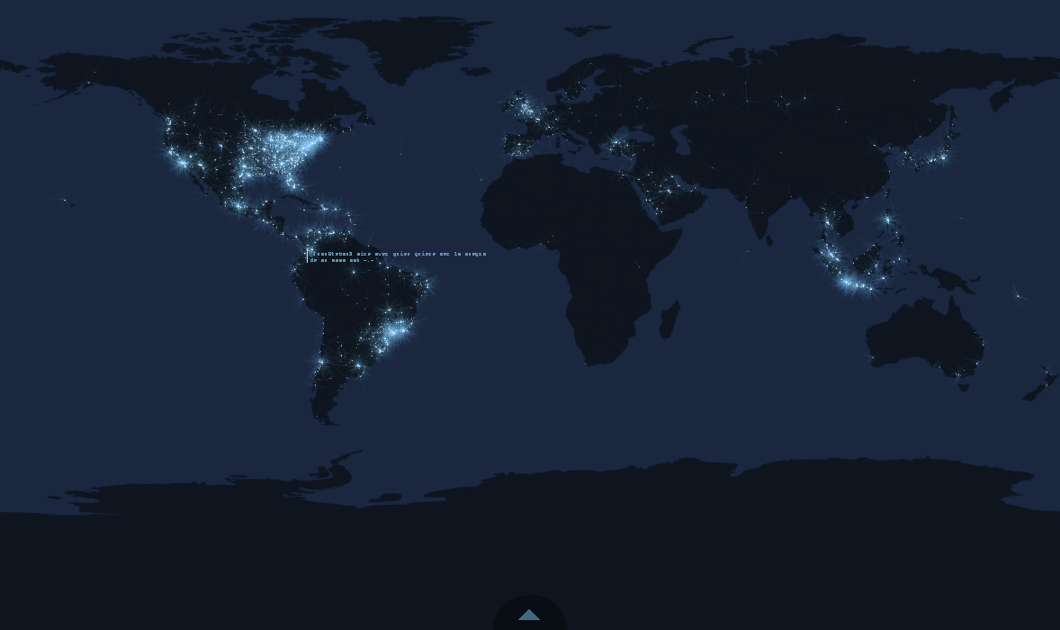
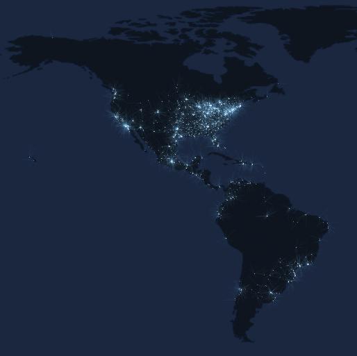
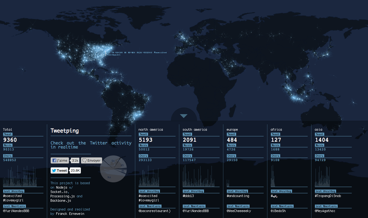
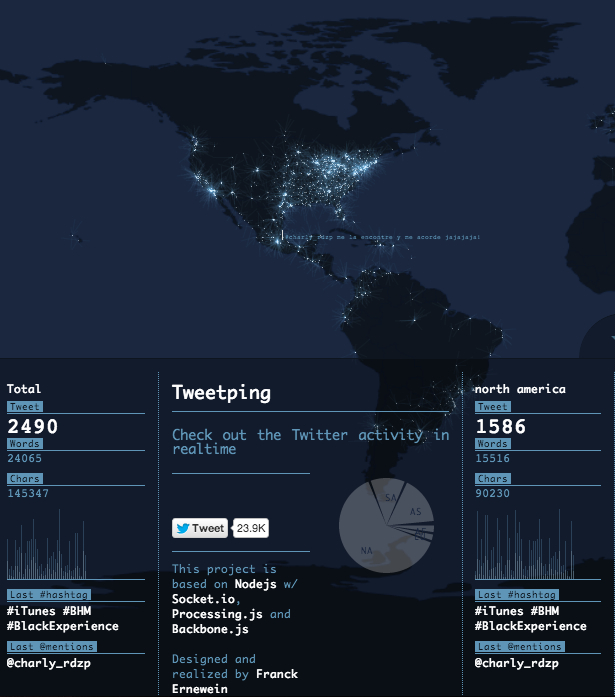
Tweetping is a freshly launched data visualisation of all Twitter activity on Earth, and the site's epic concept has a beautiful execution to back it up. Created by French web designer Franck Ernweinan, Tweetping represents every tweet in the world as a bright pixel of light against a dark density map. The planet sparkles with social media content in realtime. There’s even a dashboard of streaming global statistics and hashtags, broken down by continent.
Last April we wrote about Wind Map, a similarly design-forward visualisation of weather patterns in the United States. Both projects give elegant form to huge live data sets. But in contrast to Wind Map’s calm organic aesthetic, Tweetping suggests the wildly firing neurons of a racing human brain. Watching a planet’s worth of tweets flash by, the comparison to a manic mind feels like it fits.