The Map of the Internet
The World Wide Web is mapped out geographically in this new app that shows just how connected we all are.

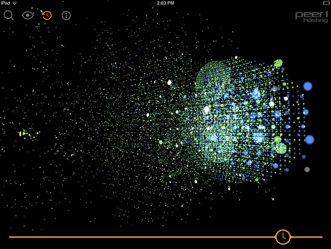
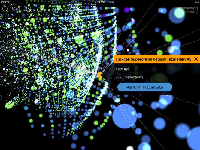
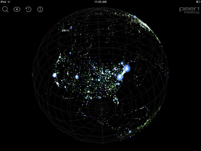
Over here at Protein, we’re big fans of data visualisations. And this new interactive app from Peer 1 is one of the more intuitive and interesting ones we’ve seen. Displaying the location of internet nodes around the world and tracking how they all connect to one another, the Map of the Internet is able to offer an informative view of how the World Wide Web fits together.
Other interesting features include a timeline showing the state of the web at pivotal moments in internet history as well as predictions of how expansion will look as technologies like fibre optic cables become more widespread. The app is available for download for iPhone and Android.

Discussion