The Gourmand
David Lane and Marina Tweed talk to us about the lauded food and culture journal, The Gourmand.
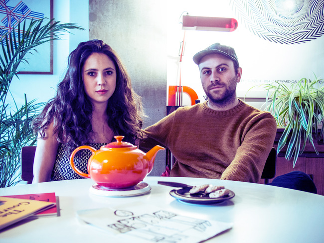
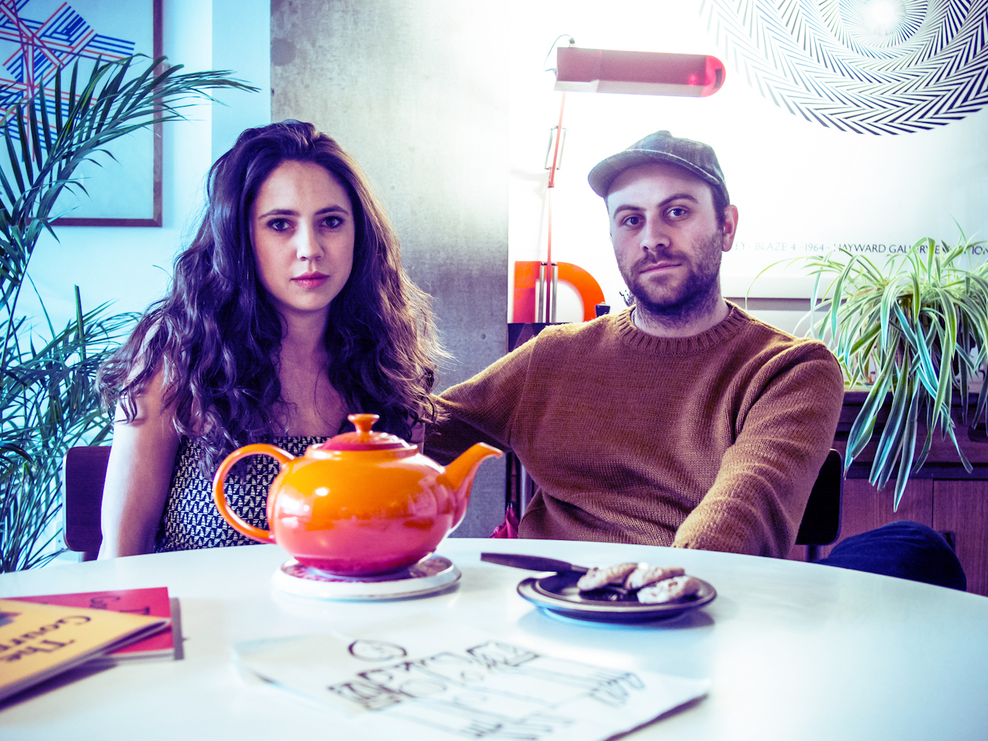
David Lane and Marina Tweed, the couple behind the lauded ‘food and culture journal’ The Gourmand, have refreshingly few pretensions about being culinary trendsetters. Marina earned her stripes managing projects for restaurant monuments, Caprice Holdings and the Soho House Group. While Dave is a designer who once worked in a deli in Lewes, South East England (the same deli, incidentally, where they met more than a decade ago; he makes quite a sandwich, evidently). But neither of them are chefs. Nor restaurateurs. And yet, hell do they have a thing for food. By their own accounts it’s almost all they talk about.
So it is fitting, then, that we open, not with the duo’s insights into the ever-growing foodie movement (a wretched term), but with their real and honest fascination for all things food-related. Because this is a key aspect to what separates The Gourmand from so many of its peers. For both the magazine itself and the couple who edit, design and publish it, food is a universal rather than a specific; a common ground shared by all the world and thus a unique platform for communication. They are not trying to drive the industry to new heights nor divulge the secrets of your favourite new chef. This is a matter of love and friendship. The print equivalent of a communal meal, shared by kith and kin, rich in discussion, storytelling, anecdote and laughter.
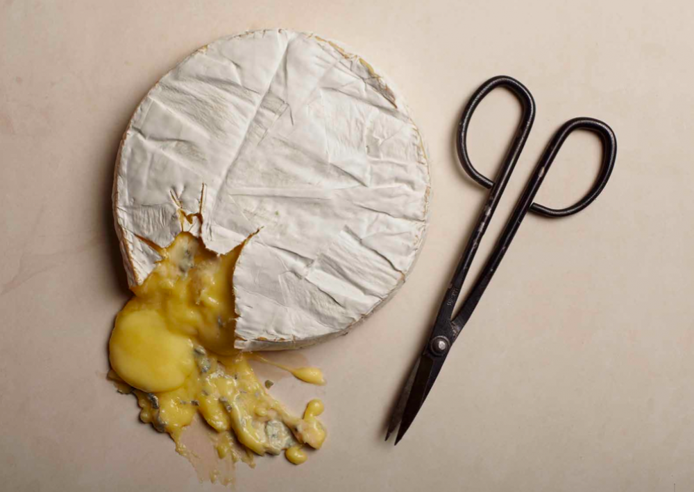
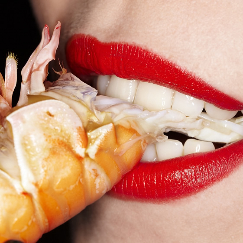
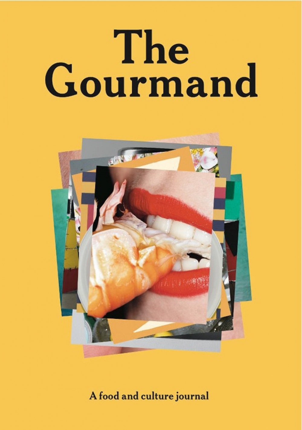
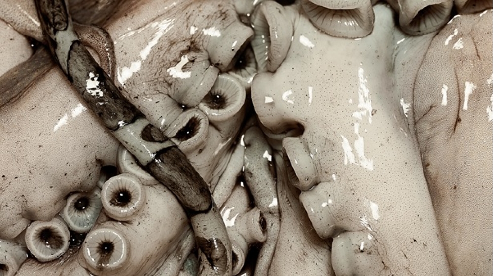
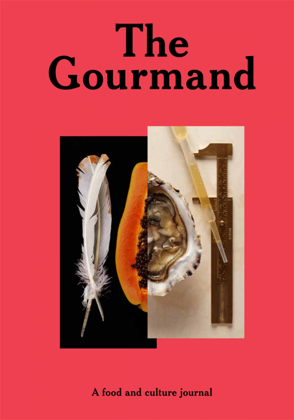
It’s very easy to have a clean white cover with a bleached out image and lots of space. It’ll look … nice. But we wanted something that when you’re in the bookshop makes you say: ‘Christ! What is that? I kind of want to put my finger in it.’
“We’re really, really into our food,” Dave says plainly. “And we love going to new restaurants–”
“But,” interjects Marina (they finish each other’s sentences with a charming frequency), “we’re also getting a bit tired of this constant push for the next concept restaurant. And we consciously want to not attach ourselves to any of that.”
“Dinner at home with a good friend or a bite to eat in a crappy caff,” says David, “everything’s as valid as each other; everything’s got it’s place. I mean, that’s what’s so nice about food: people try to make it elitist but actually it is one of the only things in the world that everyone has to do daily.”
It can be tempting to look at The Gourmand as being very much a product of its time and place: a luxurious beacon of urban, London-centric food-pornography. But Dave and Marina are conscious of trying to create something timeless, as valid today as in years to come. And despite their humble budget and print run (there were only 4000 copies of their sold out pilot, ‘Issue 00’), their magazine has wound its way around the world, from Melbourne to South Korea, Portland to Tokyo. Part of this global reach is surely due to the premium quality of the content, especially the visuals, that lie within the magazine’s first two issues. Yet, more than this, it is its accessibility. More than food being the glue between the articles and galleries, it is the love of food that binds them together – not the ubiquitous recipes or chef-techniques. “Food is universal,” they urge in unison.
Marina points to a Q&A with the artist Jeremy Deller, featured on The Gourmand website, in which he divulges his ‘signature dish’: Marmite on toast. “And that’s cool,” she says. “We’re not talking about the latest trends in food. We’re not talking about Burger-Lobster-Meat-Liquor or whatever the new place is that everyone is buzzing about. We’re trying to keep our mag timeless, so that people can pick a copy up in years to come and it’s still relevant.”
Aside from once making apparently attraction-inducing sandwiches in a Sussex deli, Dave’s main claim to professional fame is as a designer. After an unsatisfying tenure at a large design agency, he and a colleague eventually set up a smaller studio/agency of their own, called Inventory (though whether that’s pronounced In-vent-ory or In-vent-ory, even he isn’t sure). It so happens that editorial client projects – record sleeves, artist’s books, exhibitions – feature quite highly on their work-load. Which is more than a little handy given the events of a year ago.
“I was kind of missing food anyway,” says Marina, having left culinary-related project management to join a design agency herself. “And Dave had always wanted to do something on his own, but wasn’t sure what. Then he came home one day from work and said: ‘I want to do a magazine. I could run it. You could manage it. And it will be about food…’”
“Food is the catalyst for everything,” Dave emphasises. “But in a way it’s even more about the people behind it. Whether that’s a chef or an artist, whatever the thing, it’s food that holds it together. When we started work on The Gourmand, the food magazines that existed were either industry mags or foodie mags (as in ‘this is what you can do with an egg; this chef’s fermenting this or that’). And that’s great. But that’s not our expertise. And that is such a saturated market.”
So what on Earth could convince a sound and rational print designer to enter the print game with full awareness of the medium’s apparent impending mortality?
“It’s the same argument with a lot of the work we do in the studio,” says David, “that with digital exploding, physical things don’t have a home anymore. But I don’t think that is actually the case. I think print that’s trying to compete with the cost and production of web will always die; cheap CDs will always die. But doing a lovely vinyl package in a smaller volume – yes, maybe it’ll need to be more expensive, but people will always want nice things. It’s like with books: people may buy themselves a Kindle, but if you’re giving someone a book for Christmas, you’re much more likely to buy them a good hardback.
“It comes down to this: people like things. I think, inherently, humans like tangible stuff. They like nesting and surrounding themselves with nice things.”
Of course, the other main attraction for creating The Gourmand was one of personal satisfaction. As rewarding as a good client brief can be, doing something creative for yourself – and doing it well – is a very different affair. “We’re the kind of people who believe that if you’re going to do something then invest time into it and do it right,” is how David puts it. “So we made the decision early on that we’re only going to work with people who get us, and that the whole thing is going to be easy and be good. Because all the things that you can’t do with work.”
“Because that client is still paying you money and you need them,” adds Marina sagely. “And when you’re not earning any money from doing something,” he continues, “there’s not really any point in compromising. So we thought: fuck it. Until this reaches a point where it does earn money and we have to start compromising, we’re not going to compromise on anything.”
From the outset, the design approach has been to move against the current trend for minimal, style-led publications. “It’s very easy to have a clean white cover with a bleached out image and lots of space,” David argues. “It’ll look … nice. But we wanted something that when you’re in the bookshop makes you say: ‘Christ! What is that? I kind of want to put my finger in it.’”
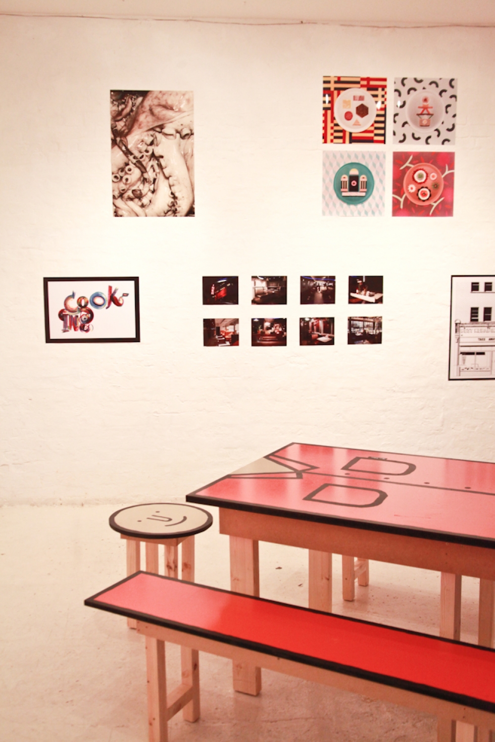
Similarly cautious of the world of advertising and of alienating their currently-avid readers by suddenly commoditising this obvious labour-of-love, they’re aware of its necessity. But they’re looking to explore the arena through bespoke ads and sympathetic brand partners. There’s also talk in the future of an online store (the placeholder is already sitting pretty up on the website) which, more than just presenting a second potential revenue stream, will also offer the coveted opportunity to work with their favourite brands on exclusive product lines across everything from food to fashion and art.Similarly, just as food is only the springboard for the magazine’s creative content, so too is the publication a platform for a variety of ‘extracurricular’ adventures. One of which is the exhibition right here at Protein’s 18 Hewett Street gallery, and the accompanying supperclub series hosted over the centrepiece of the show – a commissioned ‘Table Man’ designed by artist Jean Julian and built by Bruno Vincent – with food from local restaurant legends Rita’s Bar & Dining and Nuno Mendes Corner Room (“We go a bit nuts doing it all,” Dave admits. “But I’d probably go more nuts if I didn’t”).
“We only print three times a year,” explains Marina, “because that’s what we can manage with just us. If we were to do four, I think there would be a few weeks of unnecessary stress. I’m doing the production for all of the shoots, and if we start doing bespoke ads then there’s all of that, and Dave has another job… So four per year would be super stressful; three is just right.”
With this in mind, David mentions his admiration for publishers who output much higher volumes – the monthlies and bi-monthlies that propagate across the newsagent shelves. “But at the same time,” he adds, “when you’re reading these mags, because of the nature of how little time they’ve had to produce each issue, the content feels ‘quicker’ too. With us, it’s the other way round.”
Marina reinforces this with an example. “The last issue could have gone to print in early December. It was all there. But we both felt that something was just…” she hunts for the word, “… missing. Then we were chatting with some friends one evening, and someone said, ‘I’ve got an essay I’ve just written on America’s love affair with hot dogs. Do you want to read it?’ And that made it perfect. It had been missing that something academic. Once that was in, we both felt better. Rather than going to print to make everyone else happy in December, we went when it was ready.”
And the result? Well, you’ll just have to read it yourself now won’t you.
http://thegourmand.co.uk/



Discussion