The Age of Building
An interactive map of all 9,866,539 buildings in The Netherlands

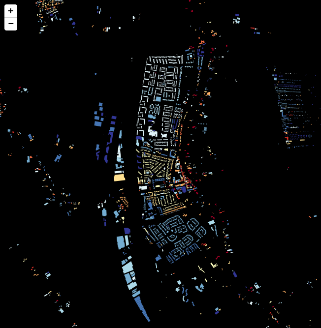
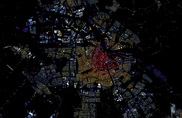
Bert Spaan, developer at Waag Society, made an interactive map of all 9,866,539 buildings in The Netherlands coloured according to the year of their construction. The map shows which cities are young - everything built after 1960 is blue - and which cities are old. And reveals how they have developed, showing older centres and younger outskirts. It generates beautiful patterns. Additionally, clicking on individual buildings will display their exact year of construction, address, area and function. Check it out here.
The data is acquired from the Dutch municipal register the 'kadaster' and is not always complete or up-to-date, but everyone can report mistakes or omissions. The map is part of CitySDK (City Service Development Kit), a Dutch initiative creating tools to make better use of the huge amount of available open city data.
Mapping the data that is available in our cities makes us see them from new perspectives. The interactive panoramic view from the top of the Shard in London, filled with audio recordings of different areas of the city, represents London's eclectic diversity. But the visualizations of 'Mapping Manhattan' are also very inspiring, showing unique hand drawn maps made by New Yorkers, telling the tale of a different New York.
Discussion