Stefanie Posavec
When envisaging a typical data visualiser at work, you’d probably conjure up images of a person slaving over rows of numbers and wrangling spreadsheets. But Denver-born and London-based data designer


When envisaging a typical data visualiser at work, you’d probably conjure up images of a person slaving over rows of numbers and wrangling spreadsheets. But Denver-born and London-based data designer Stefanie Posavec is of a different breed. Rather than simply turning a set of numbers into an information graphic, she finds data in things we wouldn’t normally associate with this type of information.
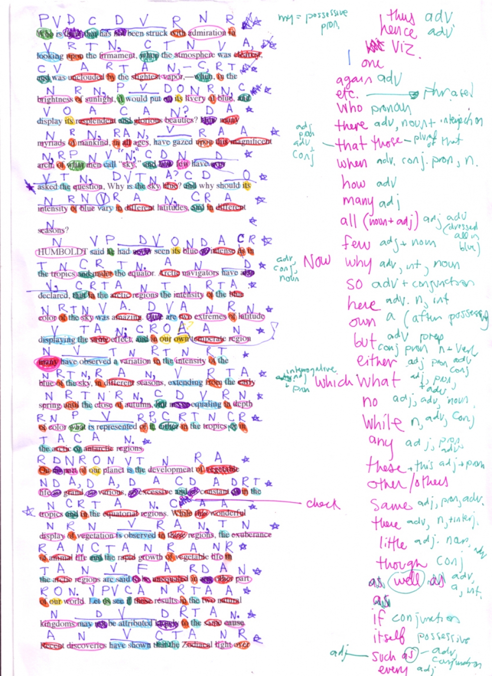
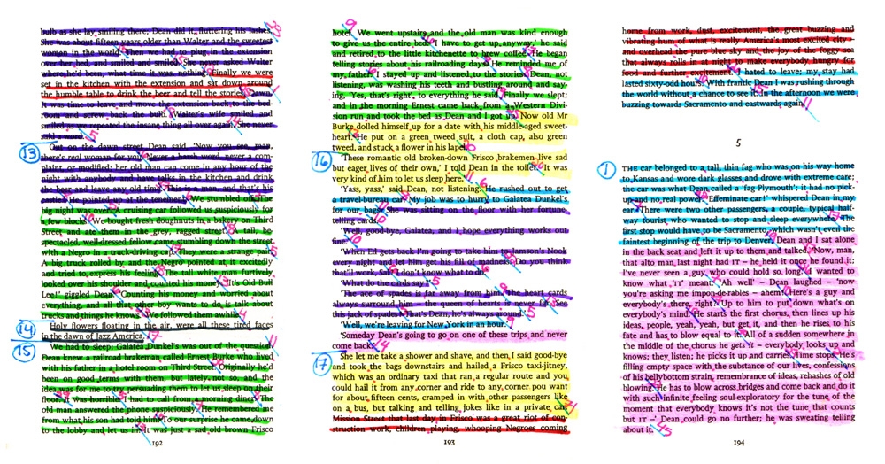
She calls this ‘hidden data’, and it could be found in something as unexpected as a novel or a song lyric. Take her Literary Organism series she completed as part of her MA at Central Saint Martins. Armed with a set of highlighters and a ballpoint pen, she set about colour coding, reconstructing and presenting Kerouac’s seminal On the Road in an entirely new way. Each sentence and paragraph was highlighted a different colour based on subject and sentence length. With this information, like the anatomy of a flower, the book was transformed into a graphic design of beautiful and detailed florets. Part One is broken into chapters, chapters into paragraphs, paragraphs into sentences, and sentences divide into words.
Rather than simply turning a set of numbers into an information graphic, she finds data in things we wouldn’t normally associate with this type of information. She calls this ‘hidden data’.
So what inspires this level of analysis? “I’m interested in things that appeal to the really vigorous detailed aspect in me,” she explains. “Everything I have done so far has revolved around things that I love such as books, language, maths and numbers. As long as I’m looking at something that I’m really interested in, it makes the days and hours of sifting through and analysing a subject easier.” She approaches data both as a source of inspiration but also aims to produce design work with a message. As she puts it: “I like design that has an underlying meaning, where everything is there for a reason. And with data everything has to be there for a reason”. It’s the type of work that pulls you in on first look, but holds your attention with the depth and amount of information each piece contains.
As long as I’m looking at something that I am really interested in it makes the days and hours of sifting through and analysing a subject easier.
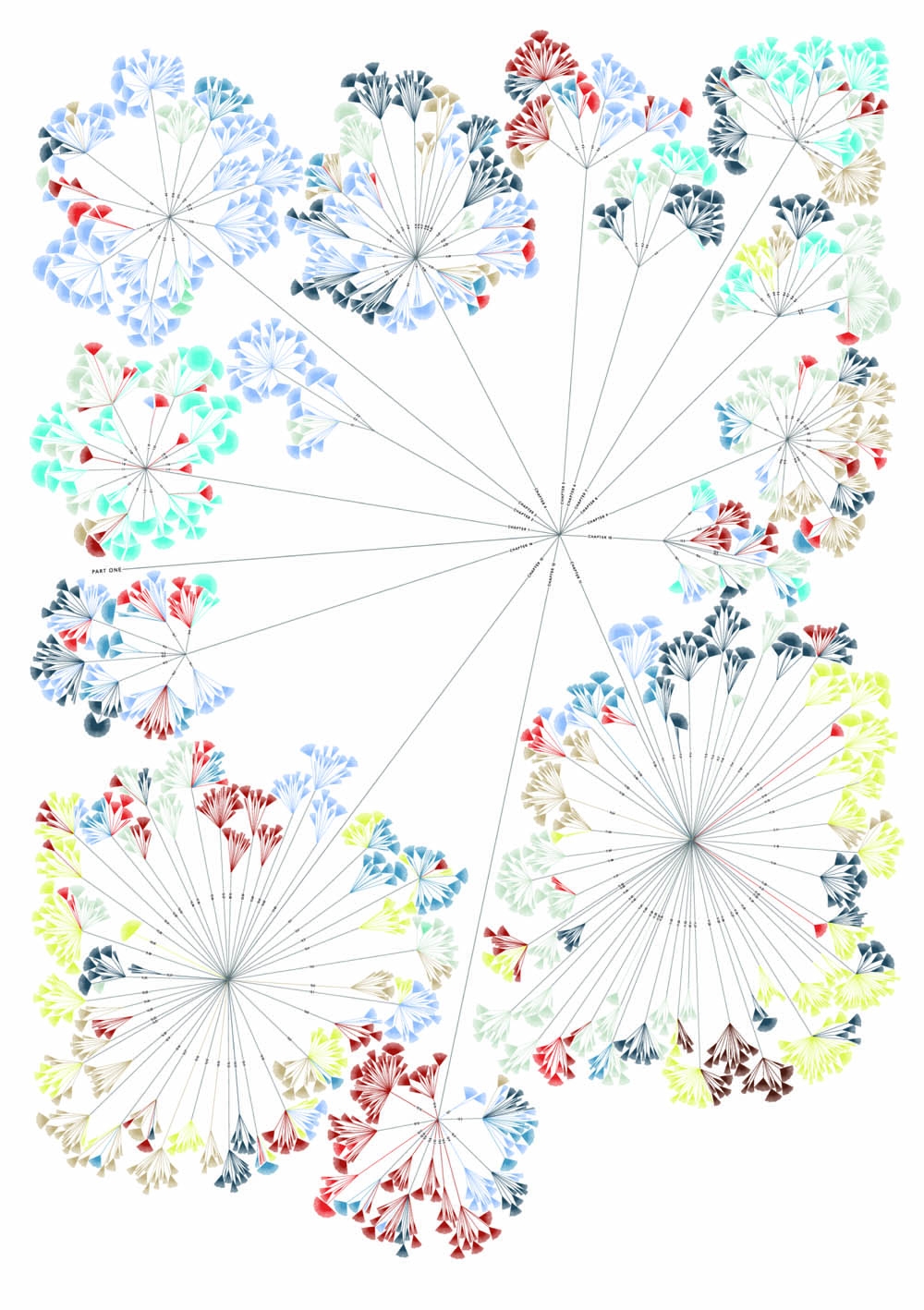
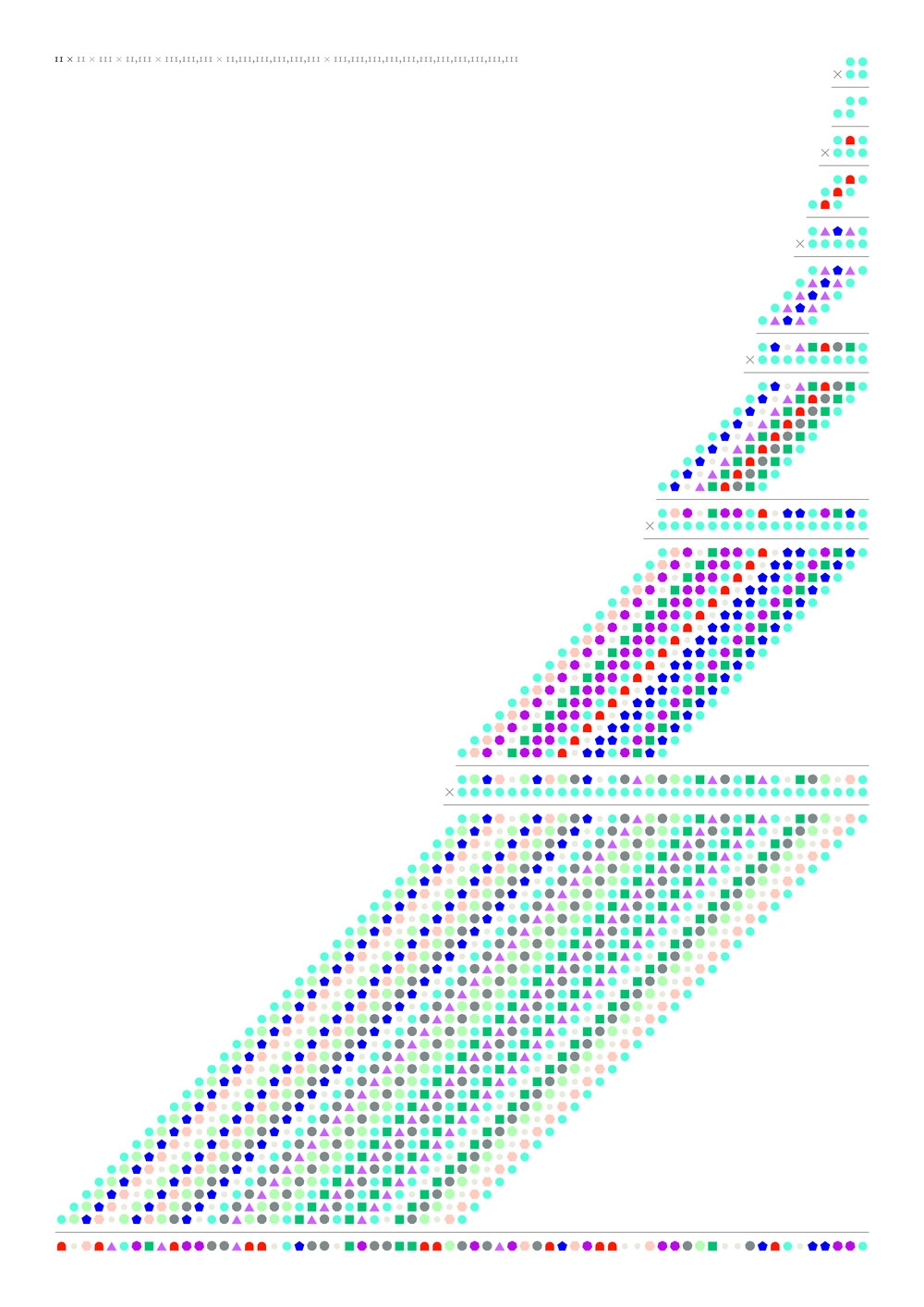
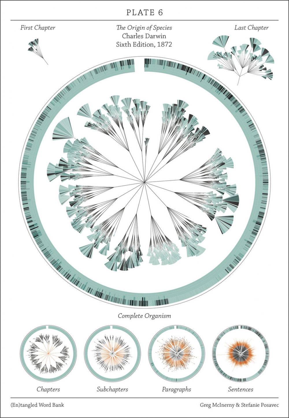
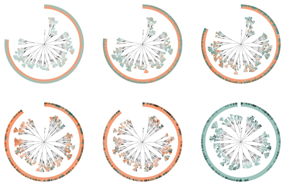
Her unique approach recently caught the eye of MoMA in New York who have selected (En)tangled Word Bank to feature in their current ‘Talk to Me’ exhibition. The piece was developed in collaboration with her brother-in-law Greg McInerny, an ecologist at Microsoft Research, and highlights the insertions and deletions of text through Charles Darwin’s six revised editions of his The Origin of Species. Following the same floral structure she developed in her Literary Organism analysis, and with the help of McInerny’s processing, the piece beautifully reveals how the naturalist edited his work over its 13 years of changes.
Probably at the more artistic and conceptual end of the data visualisation spectrum, but Stefanie’s gift for analysis and interpretation has led her into a number of commercial projects such as The Bundle Annual Report 2010, OK Go’s latest album cover and the Stephen Fry myFry iPhone app she produced for Penguin. Over the last year there has been a noticeable increase in the use of information based graphics by media channels and brands. “Anything that can compress as much information as possible into as small amount of time as possible is what everyone wants right now,” says Stefanie. “I think brands or non-profits are interested in using facts and statistics as hard evidence. Companies that have lots of statistics are asking for really good information design.”
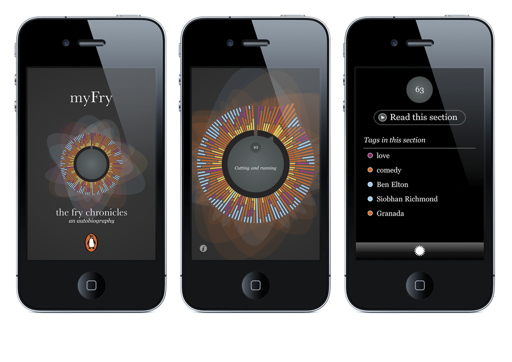
The myFry project is her first foray into digital work. With a background in book cover design and the written word it is only natural that her work has primarily revolved around print. As the book shifts from the pages to the screen this medium will come into her work, she concedes, and she has started experimenting with the capabilities that digital design offers. “Digital data visualisation provides the user with different viewpoints”, she says. “They’re able to manipulate the data more easily than with print”. “But a digital experience is ephemeral, and you’re only left with the memory of it. With print and posters they last longer - they’re more timeless. So I’d like to work with the best parts of both”.
Next Stefanie is looking to get her hands on more juicy and untouched data. “I’d love to collaborate more with scientists and researchers,” she muses. “Perhaps an artist-in-residence at a research institute; working with people with lots of interesting data that don’t really know what to do with it. And turning that data into something beautiful to show the public all the wonders that they are missing.”
http://www.itsbeenreal.co.uk/
Discussion