Season In Review
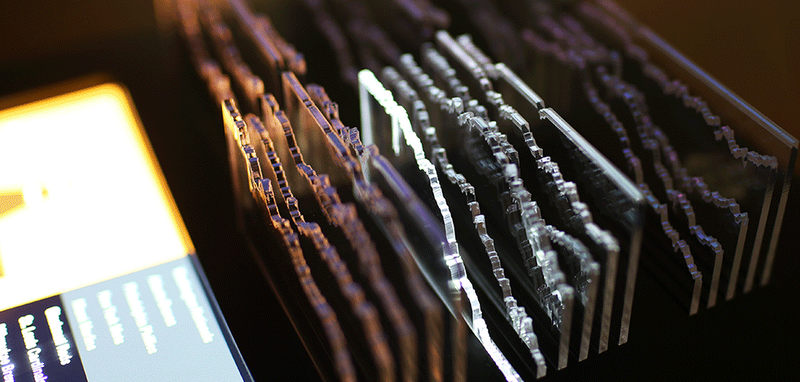
Teehan+Lax Labs combines digital data with physical sculpture to make understanding baseball statistics a less daunting prospect.

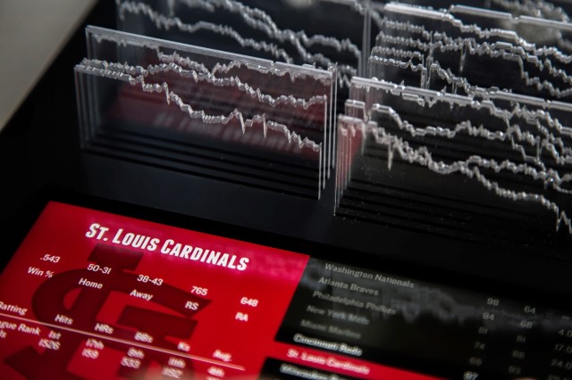
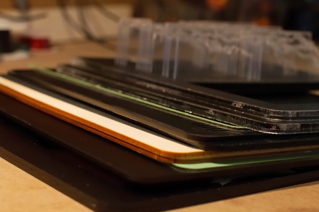
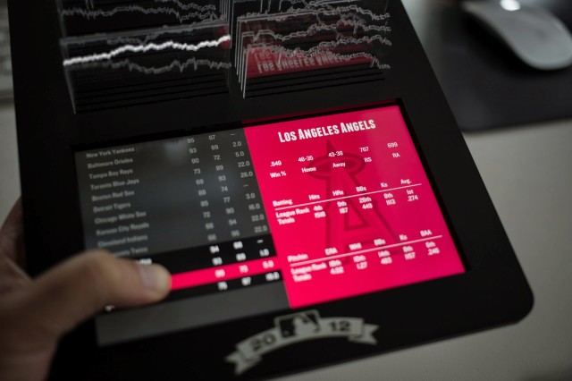
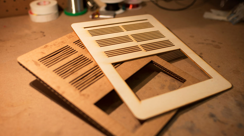
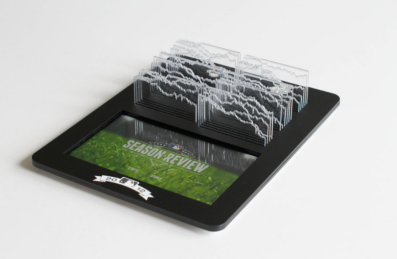
Finding ways of breaking down intimidatingly complicated data into understandable, digestible chunks is no easy task. Teehan+Lax Labs deal with this issue in Season In Review, an iPad app that also acts as an interactive data sculpture for America’s Major League Baseball. Inspired by baseball’s love affair with data and statistics, the Lab wanted to create a memento for the season that captured all the “drama, struggles and highlights” in an easy to understand display. Using MLB Gameplay data from the 2012 season, the Lab created a cover the included graphs cut in clear acrylic that act as a sculpture to accompany the app. Their aim was to organise the slides in way that was elegant but could still be read all at once. Using edge lighting on clear acrylic, the data jumps to life in a way that makes information not only accessible but quite visually stunning as well. Part data visualization, part app, part digital tablet accessory, Season In Review is an example of what happens when the physical aids in the representation of the digital.