Ravensbourne College Form New Visual Identity
The new college crest takes into consideration the needs of staff and student body alike.


The new college crest takes into consideration the needs of staff and student body alike.
Ravensbourne, the London-based digital media and design college, have enlisted the help of communications agency NB to create a new pared down crest which has been deliberately designed to place the work of students in the foreground.
The old logo, which featured clunky, unaesthetic shapes inspired by the architecture of the building, was difficult to incorporate into design work and not reflective of the college’s collective aspirations

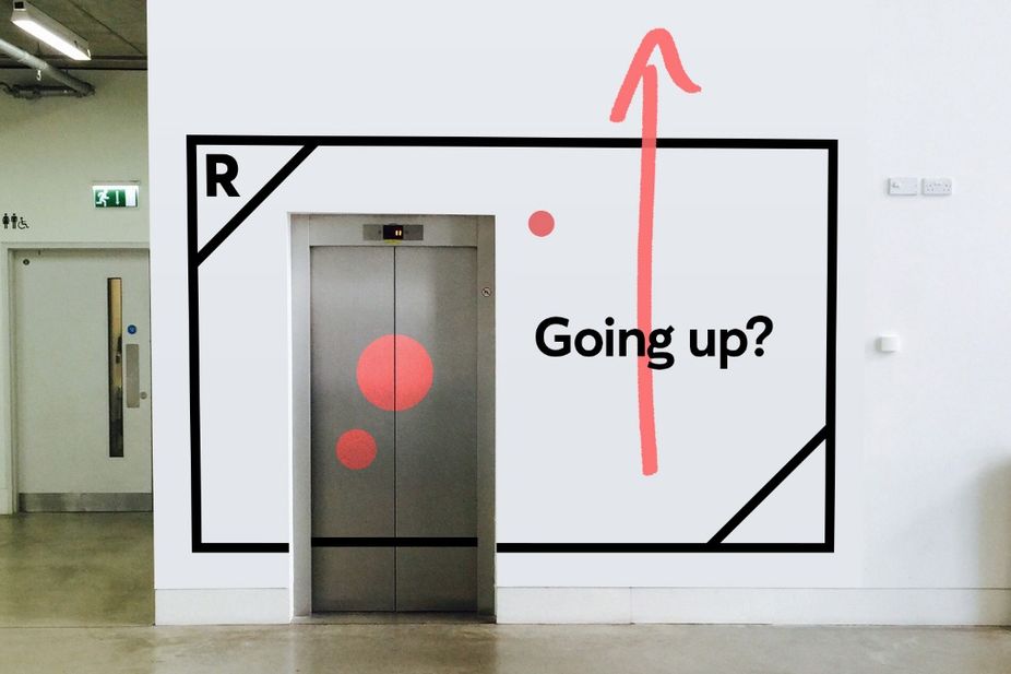
The new visual identity includes a malleable black box with the letter ‘R’ in the top left corner and a custom-made font by Kostas Bartsokas. The box’s dual purpose sees it become a framing device for text, image or video content.
Rather than foist a conventional, identikit insignia on the college’s students (a move that would have been both demotivating and exclusionary) the new logo takes care to operate in accordance with the needs of both students and staff.

If not handled with an appropriate level of sensitivity, rebranding activity can easily divide opinion, or unite an organisation’s members against it.
For further examples of considered rebranding, read about Brazilian telecommunication company Oi’s new interactive logo.


