Peter Crnokrak
Amidst the ocean of infographic mediocrity that’s out there, Peter Crnokrak stands out for a number of reasons.


While his first movements into the design realm were far more illustrative and fanciful, allowing him to turn his back quite consciously on his scientific past, with time the rigorous approach of his research background came to bear. But the real change came when he began to collect cover versions of Joy Division’s ‘Love Will Tear You Apart’ (“I love collecting things as I think a lot of designers do”).
What began as an impressively large, glorified list was eventually transformed into one of the iconic pieces for which Peter is so well-known – especially here at Protein – embedding several visual artefacts from his old scientific life to give the entertaining dataset an unpredictable dynamism. With its nuanced focus on complexity and detail, this technically-minded yet visually creative approach has become something of a trademark. “I’m a firm believer,” Peter explains, “that if something is complex and something is heavy, then it’s really dishonest to simplify it to a degree that simply panders to the lowest common denominator.”

With social networking and the easy accessibility of news sources online, we’re getting so much information of how the world This is also a perfect example of another way in which he stands out from many of his design peers: his conceptual eloquence. Tonally consistent yet emphatically precise, his sentences are as dense and loaded as his intricate visualisations. Consider his opinion on the current boom in the sphere of data viz: “A lot of people have said the reason data visualization is popular these days is because we have so much data. But I think that’s just absurd. We’ve always had a lot of data, and more data than we can actually ever deal with. The vast majority of the public don’t really care that there’s that much data – I certainly couldn’t care less. Instead, what is really is that with social networking and the easy accessibility of news sources online, we’re getting so much information of how the world works that people simply want to know more. And data visualisation addresses that issue.” He goes on to cite an unprecedented shift in public data consumption as a result of our increasing familiarity with the language of data visualisation. The effect such a shift therefore is having on wider journalism is considerable, he says, “because it allows you to deal with particular details that are way to cumbersome to deal with in [written] language. You couldn’t write out everything – that would be absurd. But you can refer to a graph, and as long as the language is tractable and understandable, that adds an entirely new dimension for the reader.
And that’s what you’re seeing, for example, with the huge explosion at The New York Times and their entire visualisation crew.” Which brings us back once more to the ocean of data designers and infographic artists amongst whom Peter stands. And what makes him stand out from the multitude, perhaps more than anything else, is the sense of scale: the intricate complexity of his designs, the sheer breadth of his datasets, and his wider vision for the future of this creative field in which his unique skillset has placed him so aptly. “The world doesn’t need any more graphs,” he says. “There are so many algorithms that will make a really beautiful graph for you. What is really required is to push the symbolic approach of representing any kind of information and coupling that with data, so that it allows you to understand data in a much more profound level than just simply seeing a bar graph. That’s where the really interesting aspect of where this field is heading: where the contribution of the artist meets the contribution of the designer who truly understands semiotics and the use of symbolism. How do you couple that with quantitative data? And where do you end up after that?”

Amidst the ocean of infographic mediocrity that’s out there, Peter Crnokrak stands out for a number of reasons. First, there is his inimitable style: with the sharp white shirt, slim overcoat, patent brogues and immaculately coiffured quiff, he resembles a data-friendly Elvis (or possibly a Nick Cave from an alternate, digital reality). And then there’s his absorbingly intricate data visualisation work… Under the moniker of The Luxury of Protest, the Canadian-born designer applies an elegantly elaborate aesthetic alongside his research background (in the field of Quantitative Genetics, no less) to unravel a variety of society’s more complex systems.
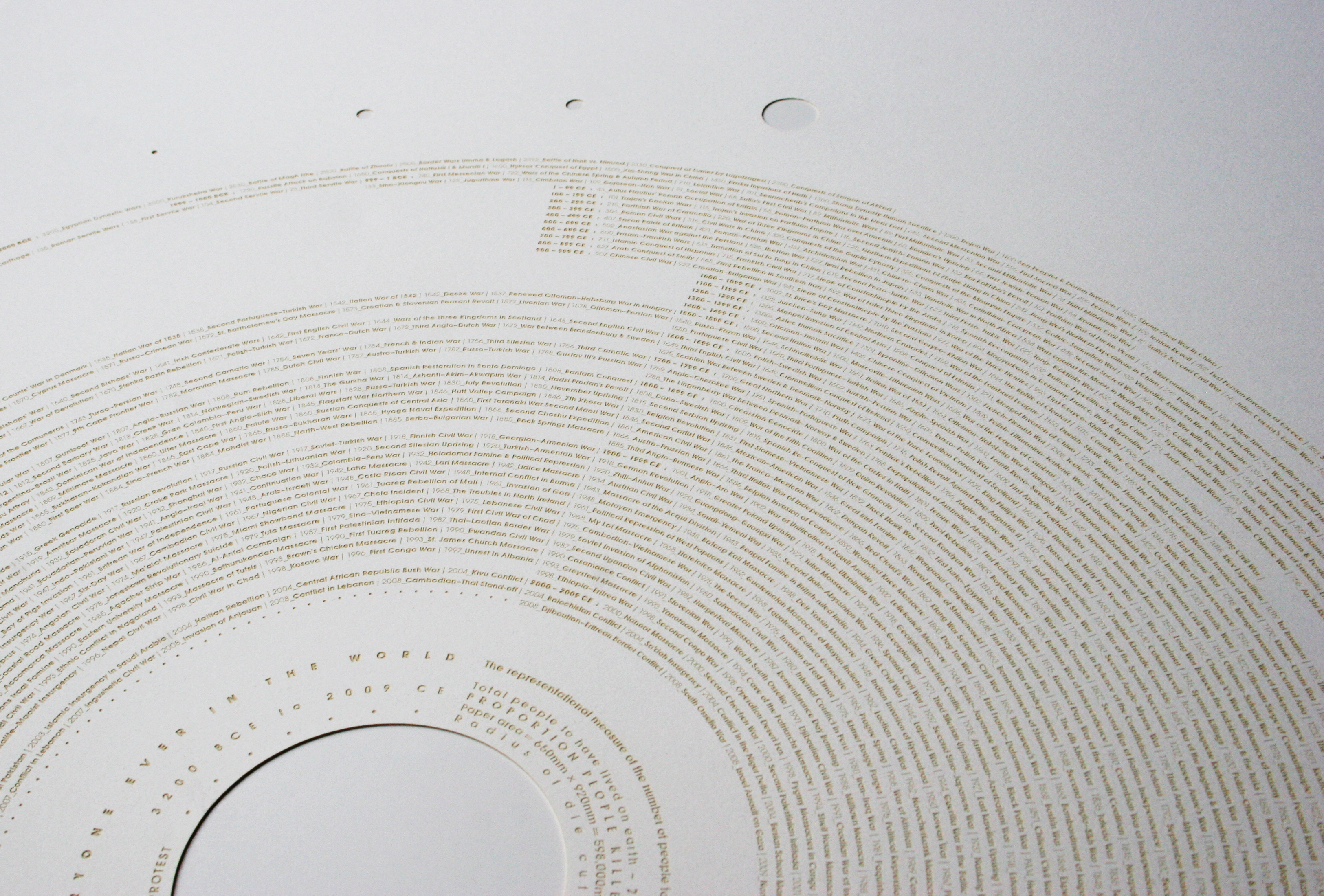
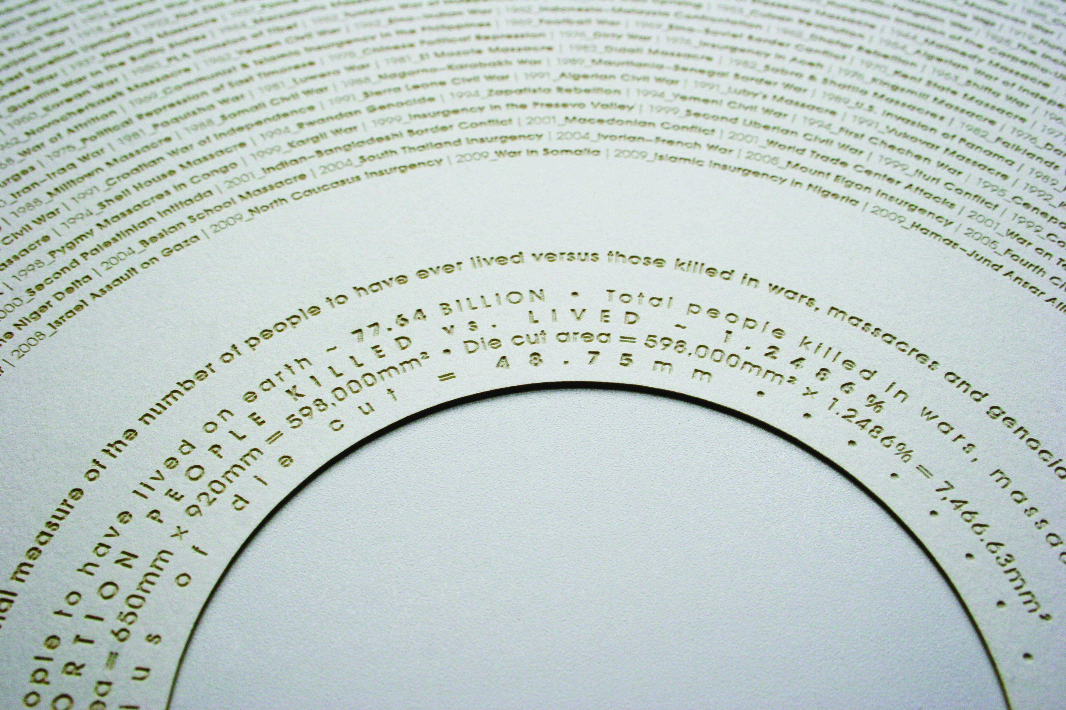
There was his ‘Maths Dreamed Universe’ (“Mathematics is the language of nature,” the piece’s explanation reads. “This [data visualization] shows the mapping of numbers 0 to 100,001 arranged in a spiral coordinate space”). And then there’s the award-winning ‘Everyone Ever in the World’ (which we featured as a limited edition print in our Protein Journal #3) – a vast, hypnotically intricate series of radiating circles that represents “the number of people to have lived versus been killed in wars, massacres and genocide during the recorded history of humankind.” So how exactly does one go from holding a professorial position in Quantitative Genetics to crafting intricate data visualizations about the very history of humanity? The 40 year-old designer smirks wryly, straightening a starched, white shirt cuff and explains that when it comes to making such a massive career transition, nothing motivates quite like Earth-crushing boredom.


Discussion