Peoplemaps
Mapping big data to show who's talking about what and where

No conversation goes under the radar on social media networks. Buzz words are picked out of every tweet, post and conversation, and with them big data is compiled for all manner of clandestine ends.
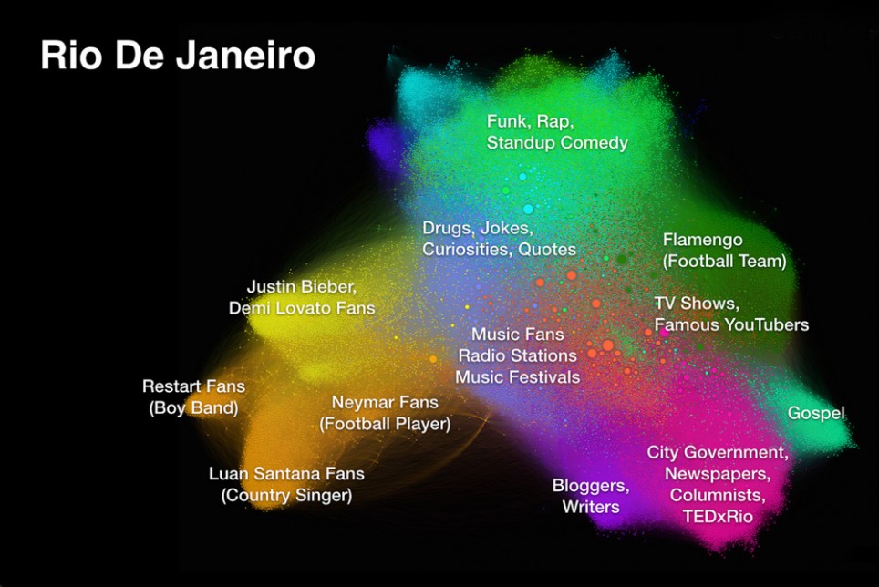
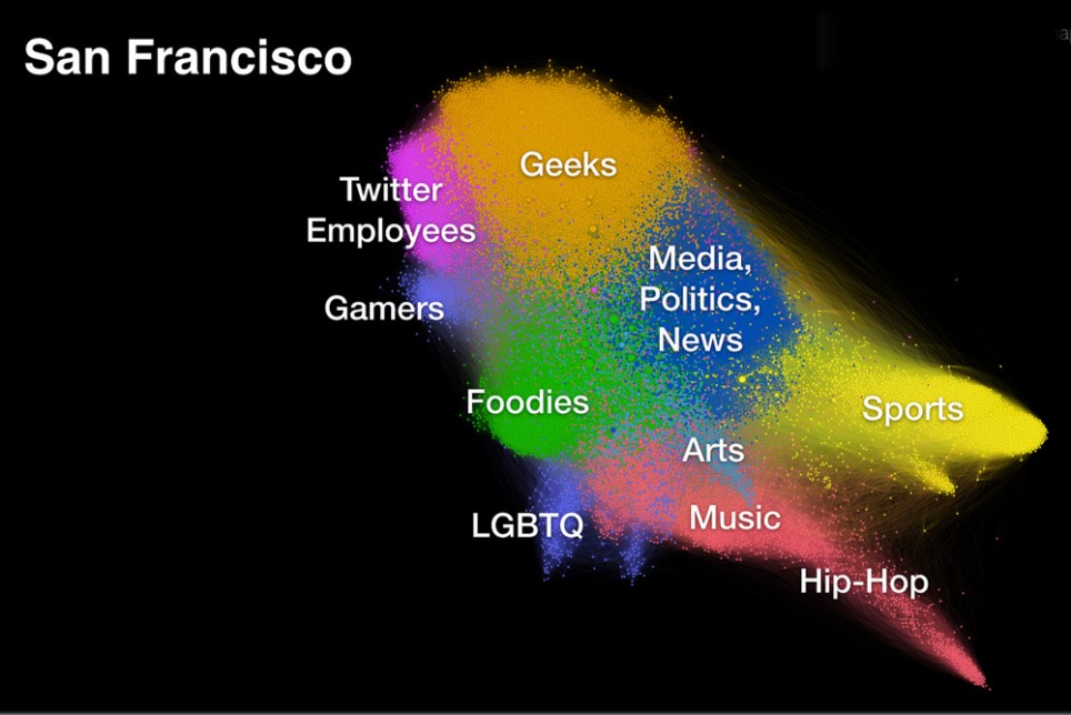
One particularly constructive end however is Dave Troy's Peoplemaps project. His maps are created using data from Facebook, Twitter, LinkedIn and other social networks to show what people are talking about and who was doing the talking, in order to compare a city’s diversity and gain a better understand of what’s important to its denizens.
The project is designed to reveal the underlying social connections, groups, and communities within a specific region. The maps produced are not geographical, rather they describe the relative orientation of communities in a city or region. Each dot represents a person (or user account), each line represents a relationship, and each colour group represents a community of interest. Communities at opposite ends of a map have the least in common.
By arranging the maps in this way, it is possible to determine how people choose to position themselves and study the patterns in human arrangement that arise between different cities. Troy sees this knowledge as an opportunity to reshape our cities to encourage diversity.
Big Data is not just a material for number crunchers, we've seen a number of artists adopting it for their practises. Artists Lauren McCarthy and Kyle McDonald, created Social Soul – a completely immersive digital installation that surrounded visitors with their own Twitter stream.
Discussion