Pantone Color of the Year 2016 Announced as Rose Quartz and Serenity
The colour house reveals its most popular shades of 2016.

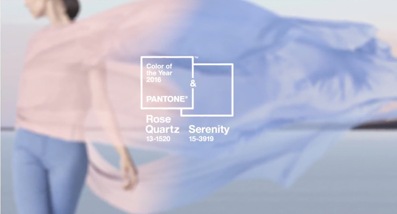
For their 2016 Color of the Year, Pantone have taken a decidedly softer approach. The color company has combined two tones for the first time as an antidote to the stresses of modern day culture, Rose Quartz (Pantone 13-1520), and Serenity (Pantone 15-5919).
Consumers caught up in the frenetic pace of life seek wellbeing as a remedy to their hectic lives, and both shades are representative of that. As Leatrice Eiseman, Pantone executive director explains, "the two hues psychologically demonstrate an inherent balance between a warmer rose tone and a cooler tranquil blue which collectively fulfill our yearning for reassurance and security; offering a soothing sense of peace and order."
The combination of both colours signals a change in attitudes towards gender representations, as industries like fashion witness an increasing blur between them. And this is indicative of a progression within wider society, as consumers become increasingly more comfortable with colour as a form of expression.
Discover The Gender Report and find out how we're moving towards a genderless society.
Discussion