Page 1: Great Expectations
An unusual typographic experiment where 70 designers created a new first page for Dickens' Great Expectations.

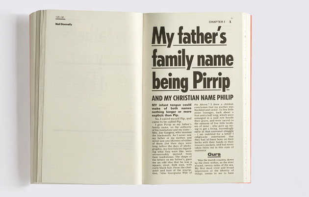
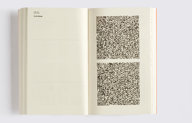
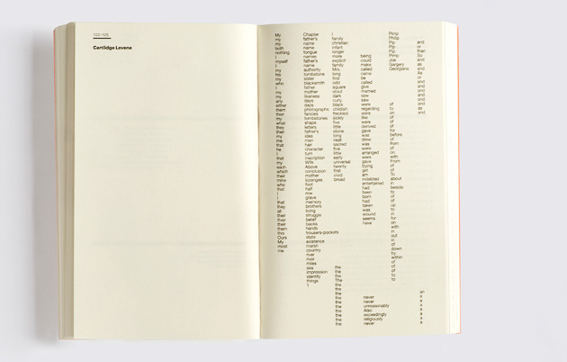
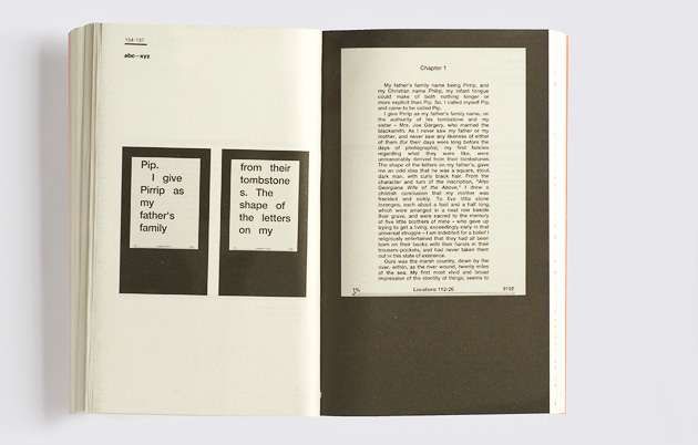
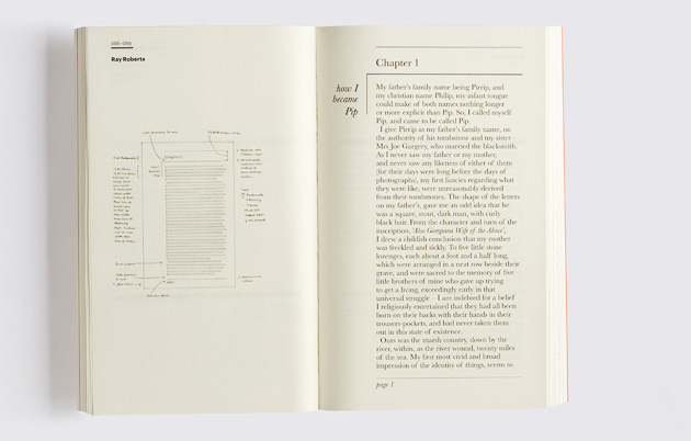
London-based studio GraphicDesign& have recently brought 70 designers together to create 'Page 1: Great Expectations', an unusual typographic experiment designed to explore the relationship between graphic design, typography and literature.
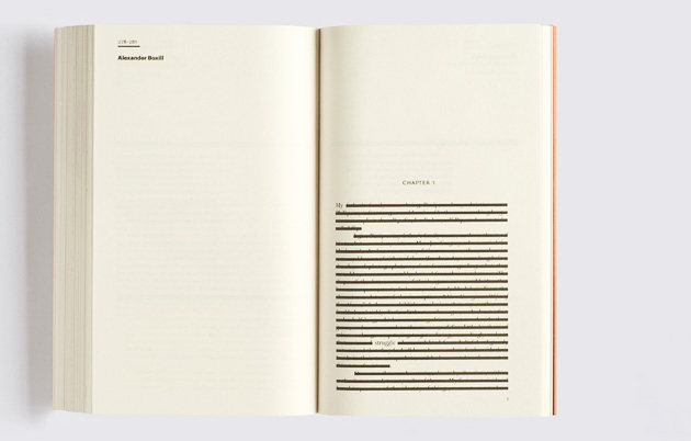
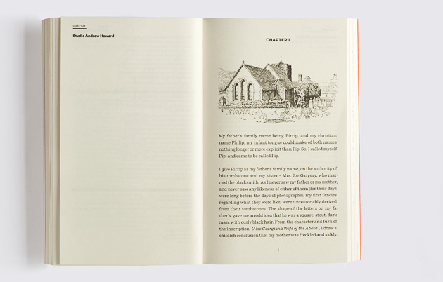
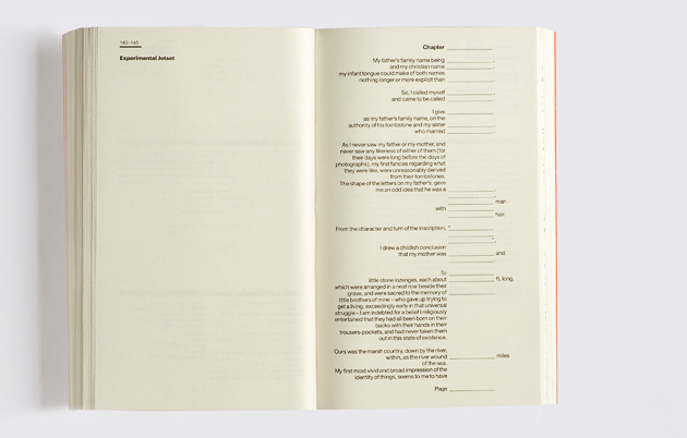
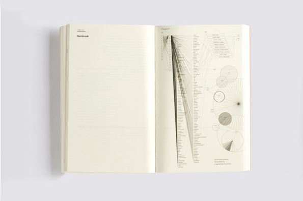
Each designer was pitched the same brief: to design and lay out the first page of Dickens' classic Great Expectations. This encouraged contributors to explore, challenge and celebrate the conventions of typography, and explores the power it has in influencing and affecting the way we interpret text. The book contains all 70 of these 'page ones' along with a short rationale from each designer which explains their decision making process. Each interpretation thus creates a new experience for the reader.
It's a fascinating and insightful exploration into all things graphic design and a visual treat for Dickens aficionados and novices alike. Check it out here.

Discussion