McDonalds Goes Minimal with New Hong Kong Branch
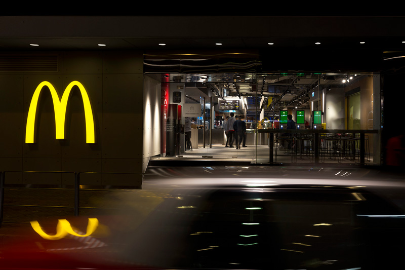
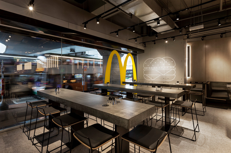
Design firm Landini Associates joined forces with the fast food chain to create a minimalist interior as an "experiment in non-design".

Design firm Landini Associates joined forces with the fast food chain to create a minimalist interior as an "experiment in non-design".

After a series of experiments in its age-old format, the Hong Kong arm of McDonald’s has gone one further, implementing a significant structural transformation in an effort to provide a more refined dining experience.
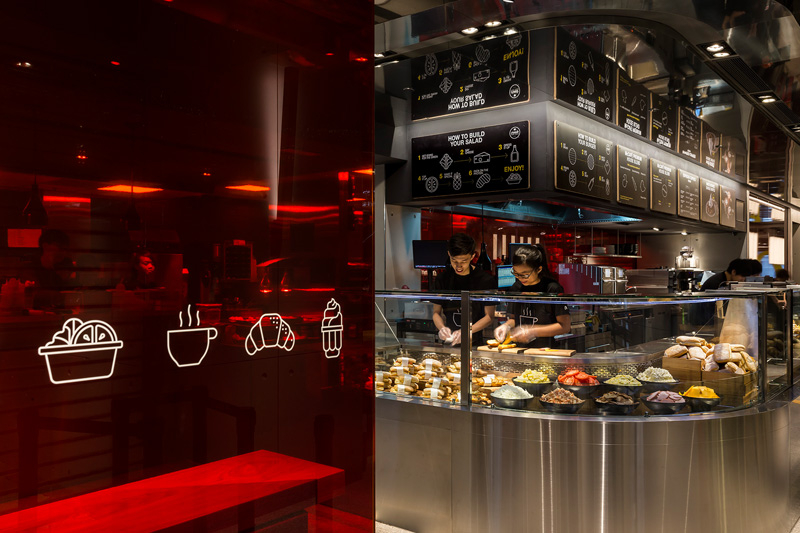
Undertaking what their Sydney-based brand consultancy have referred to as “an experiment in non-design”, the fast food chain has pioneered an alternative to the bright, garish and often obtrusive familiar visuals. Adopting a set of subtler hues and an atmospheric lighting system that adapts according to the time of day, the makeover is the most recent of McDonald’s efforts to revolutionise its dining experience through the influence of well-considered design.

By redirecting attention to the food and service on offer, McDonald’s aims to promote its sustainable product and processe, and the new aesthetic is indicative of McDonald’s strategic impulse to align itself closer to both more luxurious, and slow-food focused institutions.
Equally notable however, is how it is representative of the broader shift evident amongst fast food chains to offer something more attractive to increasingly demanding consumers engaged in the evolving, and widespread, foodie culture.


Discussion