Browse through local data from the Census Bureau's American Community Survey on a series of interactive maps documenting race…
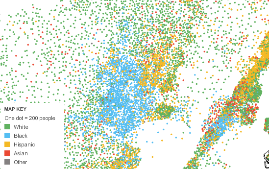
This came out a little while ago but it's still pretty neat. You can browse local data from the Census Bureau's American Community Survey on a series of maps documenting race and ethnicity, income, housing and families and education. Differences are marked by varying coloured dots as seen in the key above and more detail can be found when you scroll over areas of the map.
As they are based on figures from samples taken from 2005-2009, they're not 100% on point. Still, you can get a general idea of American life by following the clusters of colour all over.