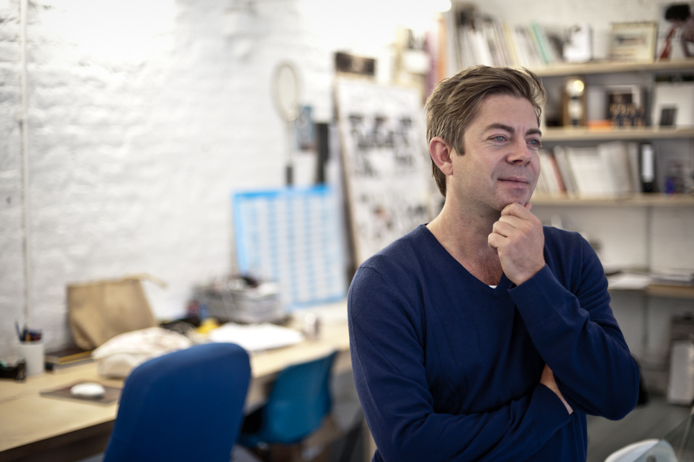
Dan Crowe - Port Magazine
Editor, cofounder and co-publisher of Port magazine, Dan Crowe is to magazines as Fergus Henderson is to food – innovative,…

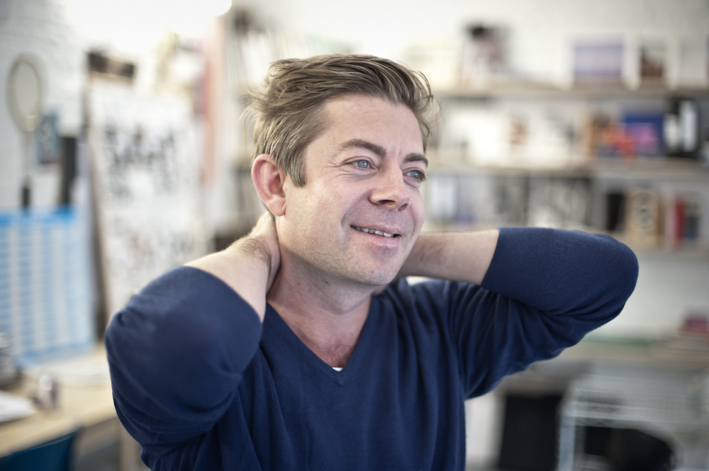
Editor, cofounder and co-publisher of Port magazine, Dan Crowe is to magazines as Fergus Henderson is to food – innovative, full of substance and with an intelligently retrospective sensibility. Henderson’s St John is, perhaps coincidentally, just down the road from the Clerkenwell-based Port office. Little wonder, then, that Crowe is something of a regular there. Maybe that’s also why there was such a charming, wine-tinged interview with the restaurateur in the magazine’s first issue. It’s this appreciation of differing concepts of fame that is one of Port’s defining features: taking some traditionally famous names (Daniel Day-Lewis stole the cover on the inaugural issue) and mixing them in with, in Crowe’s words, “men who are not well known – but very good at what they do.” And indeed the second time around the magazine does not see an instantly recognizable face emblazed on the cover, opting instead for David Remnick, Editor of the New Yorker. “It seems very important to us to try and do things differently … but not just for the sake of being different.
The point is, it’s not just famous people who are interesting. The great thing about being an independent publisher is that we can decide who goes on the cover.” At a time when people are busily debating the death of print, Crowe is a man who has taken it upon himself to reinvent and reinvigorate the industry. First off, he point blank denies the medium’s death. “In fact, small tier magazines such as Port or Fantastic Man are doing really well and these magazines are actually growing.” And central to his approach to this growth is combining the tenets of old media with the latest technological advances and recognizing their capability to enhance and expand the original product – “All of the stuff that’s going on the iPad is basically going to be a moving 3D version of the magazine. But its not really going to be the content of the magazine. If you want the magazine you should buy the magazine.” At least his priorities are clear.
It seems very important to us to try and do things differently … but not just for the sake of being different.
With Matt Willey and Kuchar Swara joining him at the helm, the trio has succeeded in producing and publishing a magazine where advertising, long the captain of the publishing ship, actively takes a back seat. “There’s always going to be a relationship of sorts between an advertiser and the content. The problem really is when you have editors too close to their publishers who decide they need advertising so much they just do whatever the advertiser wants. It can work out really well, but the problem is that with a lot of mainstream magazines, it’s really obvious to the buyer that the content is basically paid for by the advertiser and that’s just demeaning. It’s not treating the person buying the magazine with respect. It degenerates the quality of the content and it’s just pointless.” And quality is clearly of critical importance. Every aspect of the magazine’s format and design has been scrutinized and tweaked to reflect the core attitudes of Port. “It’s simple, it’s masculine, it’s a bit old school,” says Crowe. “A lot of our philosophies towards the magazine are routed in the ‘60s. And so we thought of the idea of Port as being unashamedly male – but not in a bravado, pathetic way.”
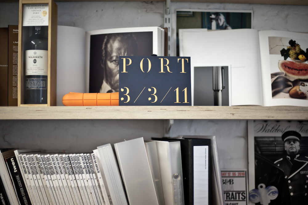
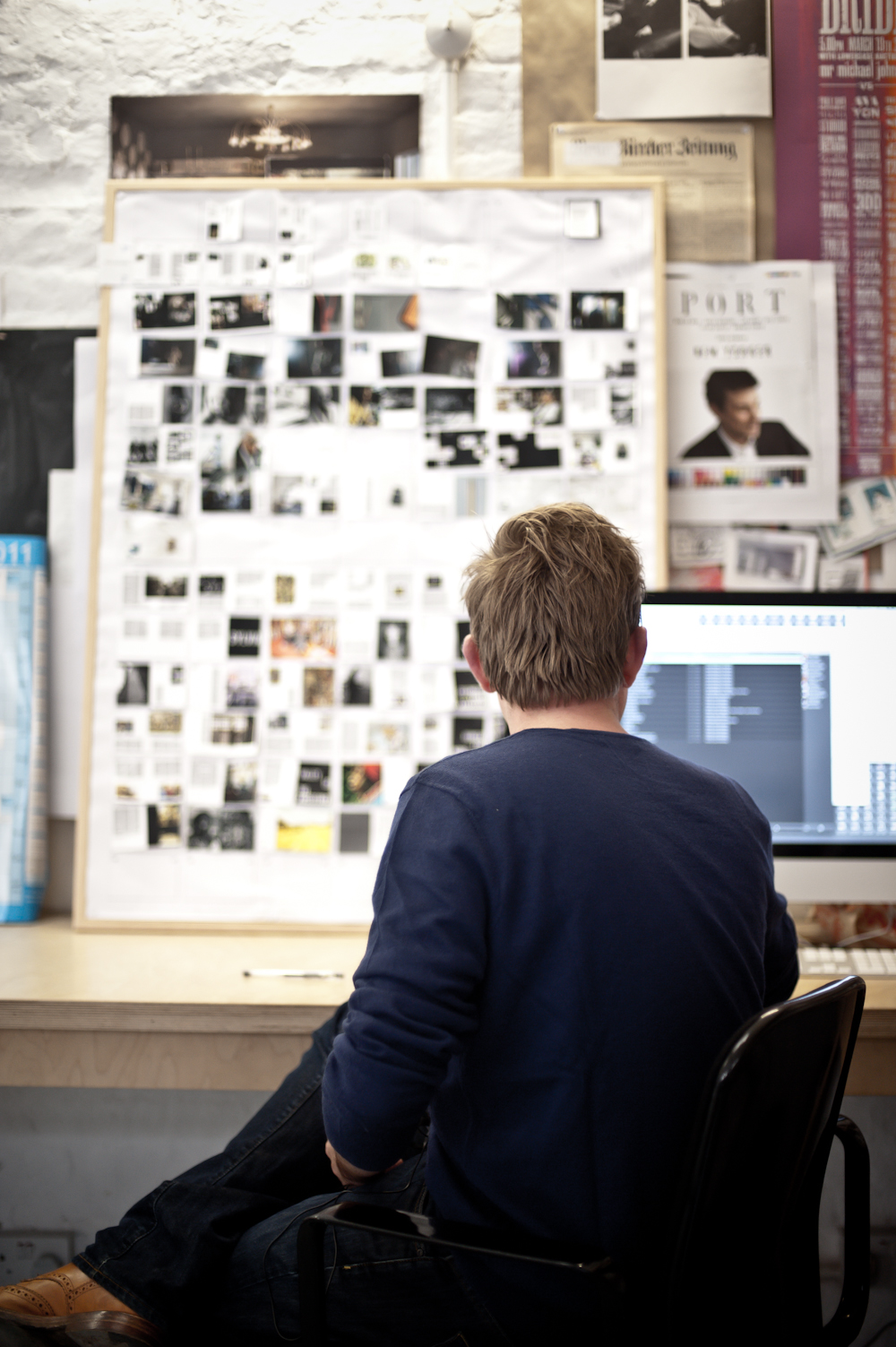
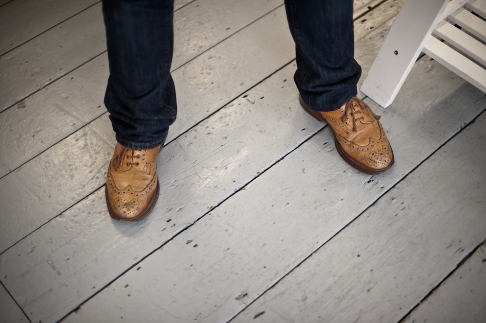
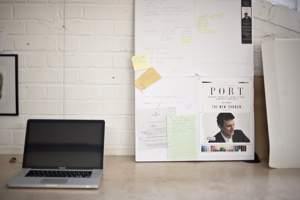
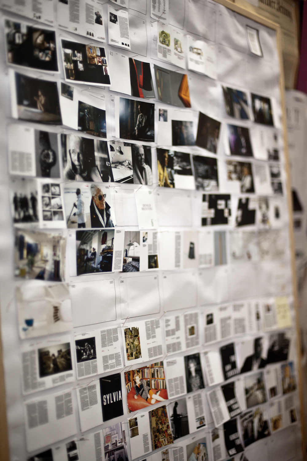
Everything hangs together and presents a united front of what the brand represents right down to the white-washed walls and tidy ephemera of his warehouse-style studio. Everything harks to the man behind it all, whose refined yet simple appearance speaks to the point. Details are clearly central – right down to the bespoke typefaces that were created in-house by graphic designer and co-publisher, Willey: Port 1 is a stencil typeface that features as the cover and section headers, whilst MFred acts as the feature header. Of course, you don’t reach a point of such high finesse overnight. And despite the magazine’s concept being conceived in a pub, the ins-and-outs are, to use Crowe’s words, born of “a combination of all the mistakes I’ve ever made.” After graduating from Goldsmiths in Fine Art he made a change of tact and decided to publish the literary magazine Butterfly. This was succeeded by a long-standing stint at AnOther (the brainchild of Jefferson Hack) and then Zembla (a literary and arts magazine). Key mistakes made ranged from a lack of money to dealing with unruly publishers. Which is why, lessons firmly learned, this time round the content is firmly in Crowe’s safe hands. So if you enjoy good food, movies, fashion, poetry and most importantly Curb Your Enthusiasm, then this magazine needs to be held firmly in your hands.
The point is, it’s not just famous people who are interesting. The great thing about being an independent publisher is that we can decide who goes on the cover.” At a time when people are busily debating the death of print, Crowe is a man who has taken it upon himself to reinvent and reinvigorate the industry. First off, he point blank denies the medium’s death. “In fact, small tier magazines such as Port or Fantastic Man are doing really well and these magazines are actually growing.” And central to his approach to this growth is combining the tenets of old media with the latest technological advances and recognizing their capability to enhance and expand the original product – “All of the stuff that’s going on the iPad is basically going to be a moving 3D version of the magazine. But its not really going to be the content of the magazine. If you want the magazine you should buy the magazine.” At least his priorities are clear.
Discussion