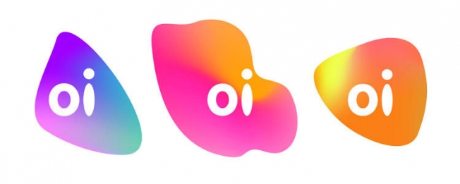
Brazilian Telecoms Company Oi Launch Interactive New Logo
The new reworked logo is indicative of a company who are aware of their identity and purpose.


The new reworked logo is indicative of a company who are aware of their identity and purpose.
In the cluttered arenas of branding and advertising the constant struggle is to create content that engages the intended recipient in an authentic way. One method of ensuring that this engagement is produced, (and maintained), is to ensure that your message is inimitably tied to what you do.
Brazilian Telecoms company Oi, (which means “Hi” in Portuguese), look to have embodied this approach innovatively by creating a new interactive logo that responds to sound.
The flexible new logo, developed by creative agency Wolff Olins and digital designers Onformative, shifts in size depending on the volume of sound and changes colour according to the pitch of the sonic stimuli.
In a move that reinforces the purpose of the logo, and by extension the identity of the company, customers will be able to record a personalised version of the logo as it responds to their voice when they visit Oi stores.
The Asics ‘Want It More Campaign’ and the Freepeople and YOGASCAPES wellness retreats are two further examples of this kind of cohesive branding.


