Anatomy Of A Mashup
Under the moniker <a href="http://themaninblue.com/">The Man in Blue</a>, graphic designer Cameron Adams…

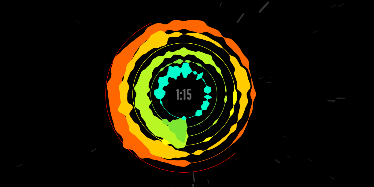
Under the moniker The Man in Blue, graphic designer Cameron Adams has visualized and dissected his 23 song mash-up "Definitive Daft Punk". The visualization cuts up the song, beautifully breaking it down by parts and showing in realtime how each works in contributing to the whole.
His aim is to show the complexity and layering involved in creating a mashup, essentially a piece of music comprised of tiny sections of songs. The 6 minute song is his homage to Daft Punk's discography, and shows all the layers, cuts, levels and equalisation of the 23 differing songs involved. This anatomy of the track Adam’s hopes will "give a new insight into the artform of the mashup".
Utilizing the latest HTML5 and CSS3 language, each song is represented by a unique colour resulting in a hypnotic swirling and rhythmic design.
This piece is riding the strong recent trend of interactive data visualization, and finding new ways to present information. Take a look at some other great examples of data visualized here and here, and turn your speakers way up and get your animated Daft Punk hit here.
Discussion