A Handsome Atlas
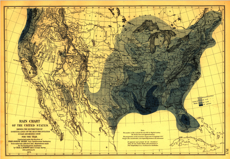
Choropleths, wild maps and small multiples. Oh my.

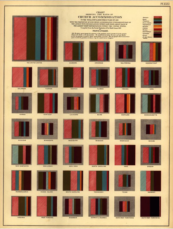
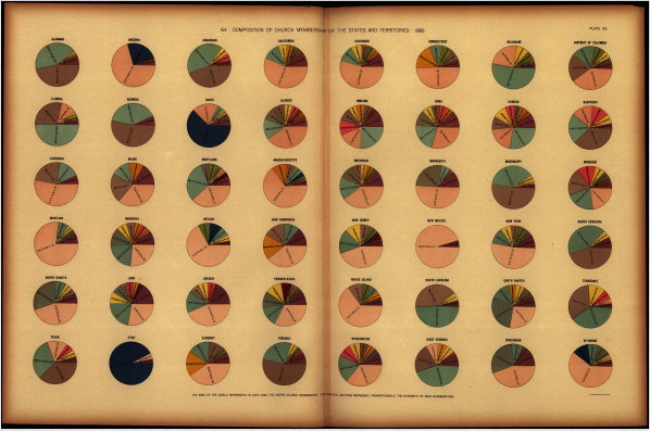
A Handsome Atlas is an online collection of three decades worth of late-19th Century US census data. And there are more pie charts than you can shake a bar graph at.
After coming across the documents at the US Library of Congress, web developer Jonathan Soma from Brooklyn Brainery – noting how difficult it was to navigate the volumes in their existing state – decided to create a place for them to live online.
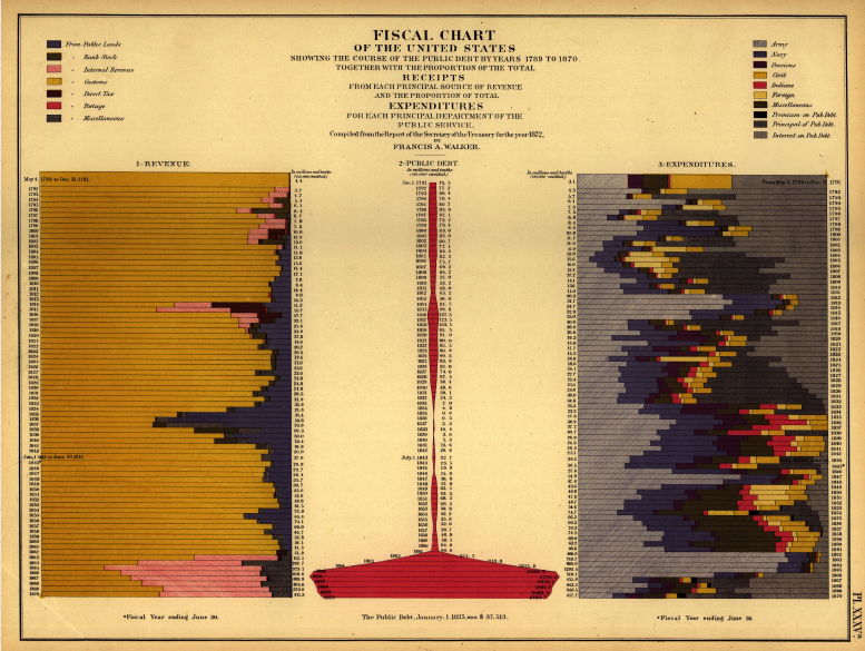
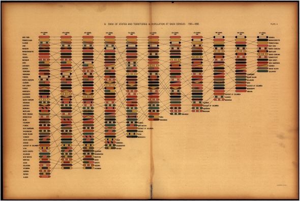
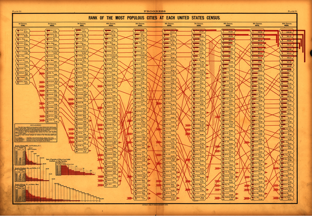
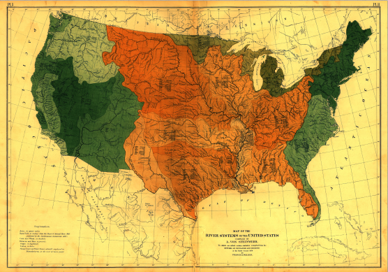
After the Civil War the US ramped up their Census and produced some remarkable graphs to display the data. The first Statistical Atlas, published in 1874, was headed up by Francis Walker, with famed topographer Henry Gannett (founding member of the National Geographic Society, and known by many as the 'Father of the quadrangle') taking over the later editions.
In A Handsome Atlas each page of the 3 volumes has been uploaded for users to explore, play around with and comment on, and particularly interesting charts pulled out and examined as blog posts. With data visualisation becoming so popular in recent years, its nice to see where it all started – and maybe get a little inspiration from some of the past masters.
Discussion